Plum Wedding
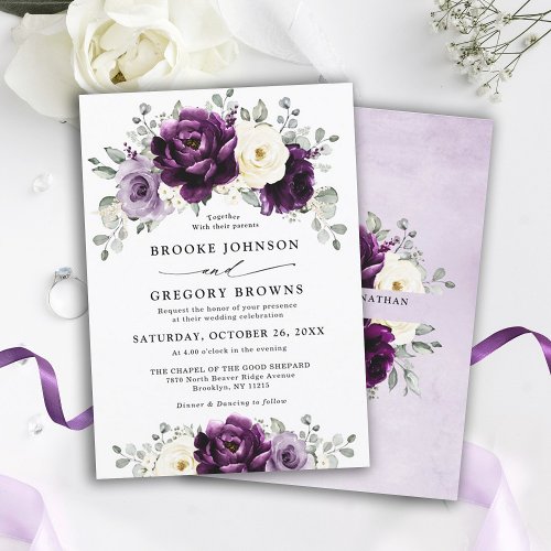
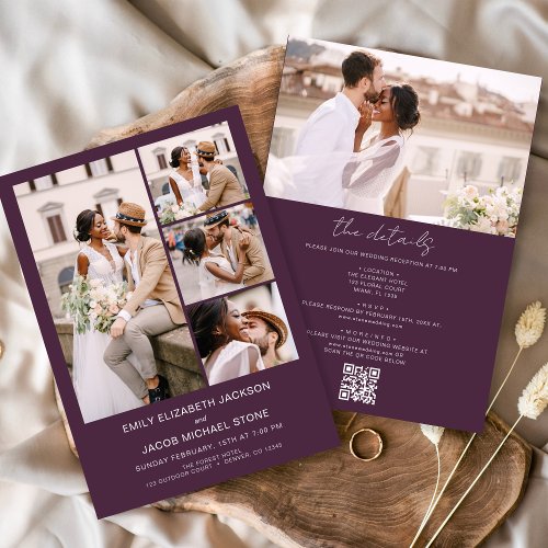
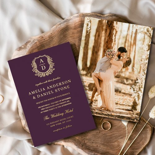
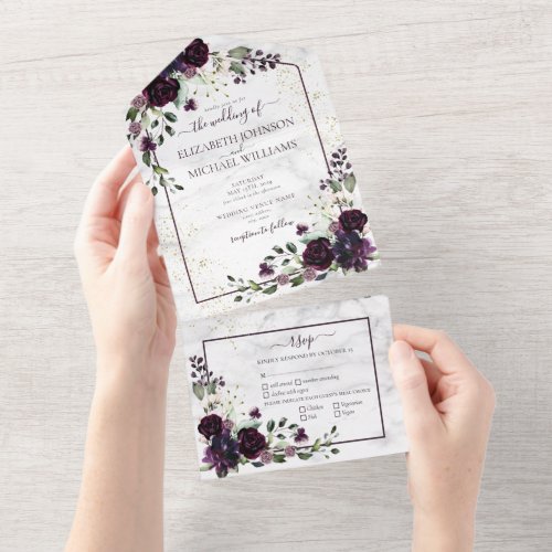
Plum is the palette couples reach for when they want colour with actual weight to it. Deeper than mauve and moodier than burgundy, it reads jewel-rich under evening light and softens beautifully against champagne and cream by day. It suits autumn vineyards, candlelit barns and black-tie ballrooms equally, and it photographs far better than most dark shades because the berry undertone keeps it from flattening to black. Below are the exact hex codes, plus matching stationery, signage and reception pieces in the same tones.
Where to shop this palette
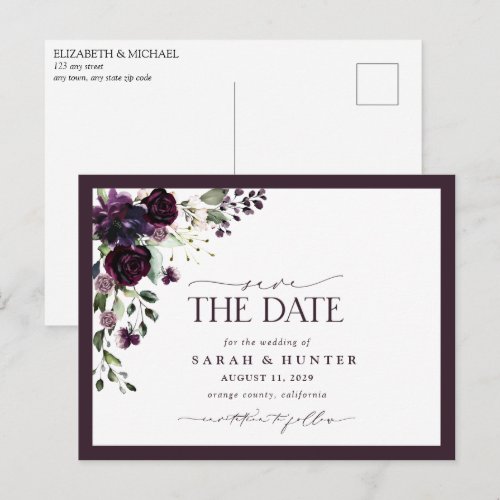
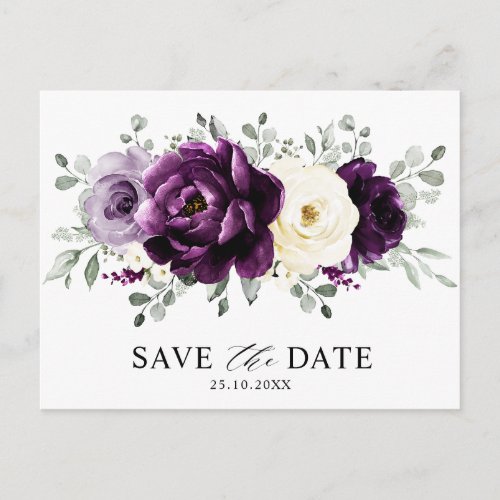
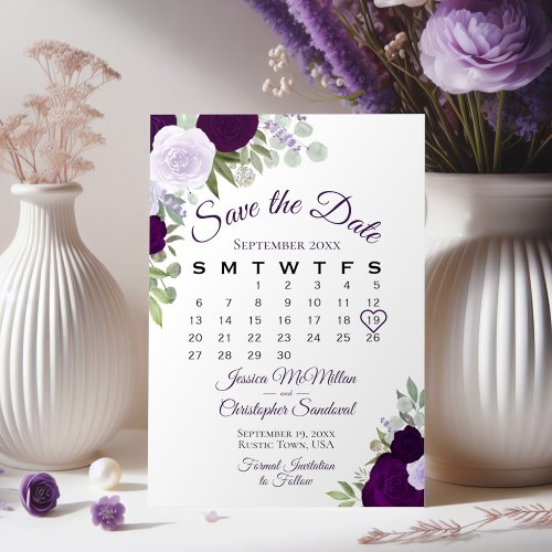
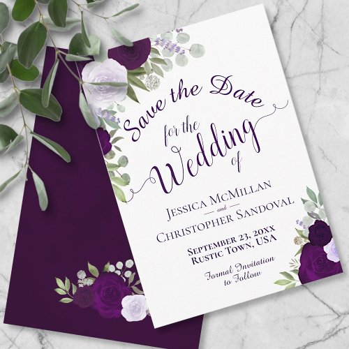
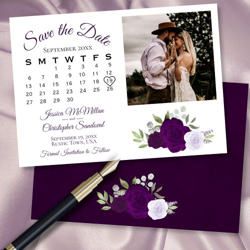
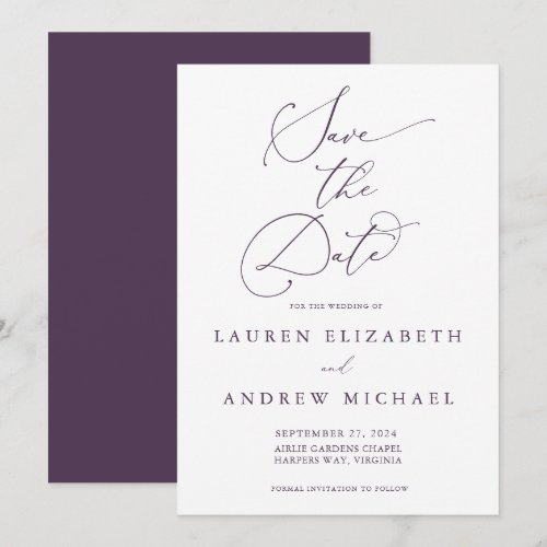
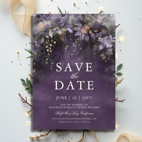
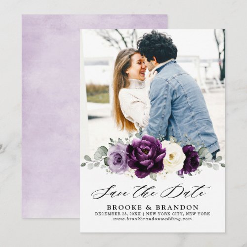
Save the Dates
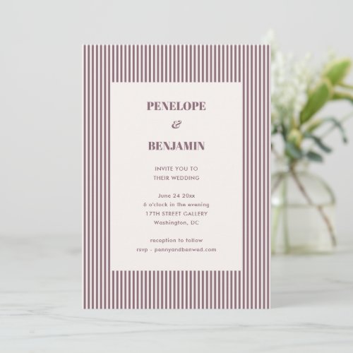
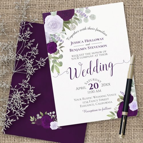
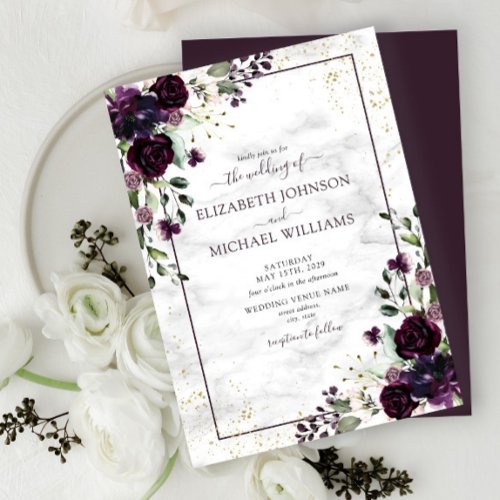
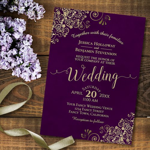
Invitations
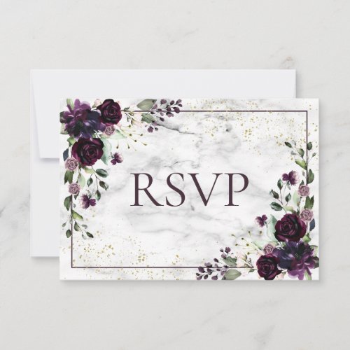
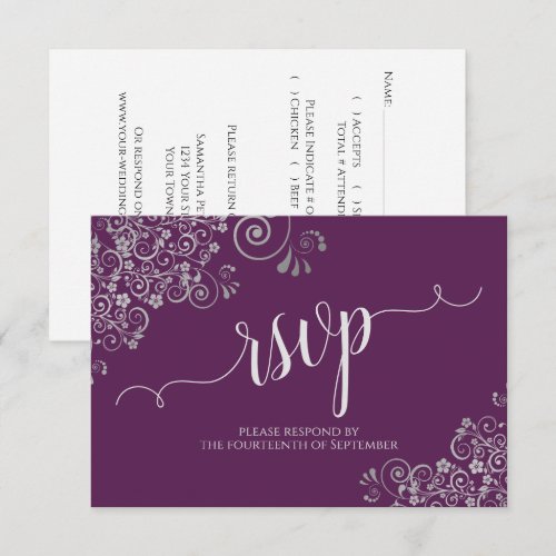
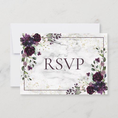
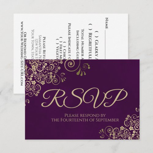
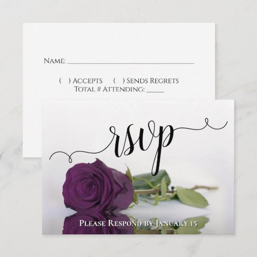
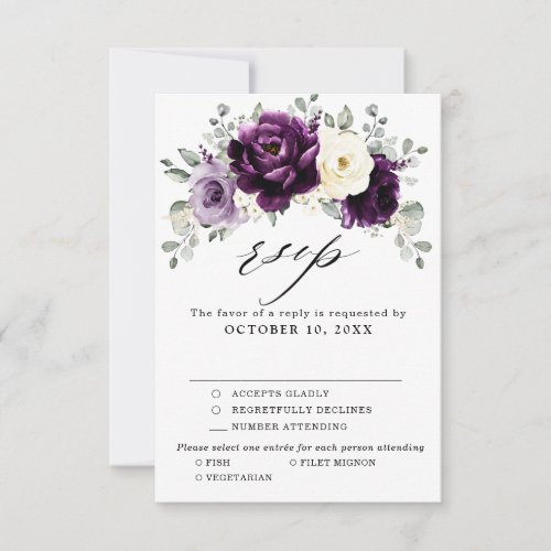
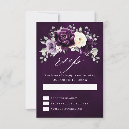
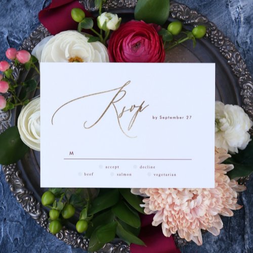
RSVP Cards
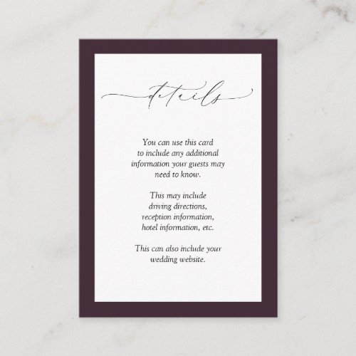
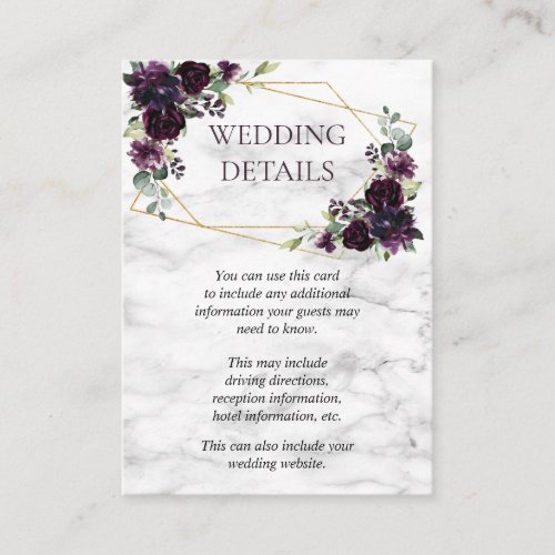
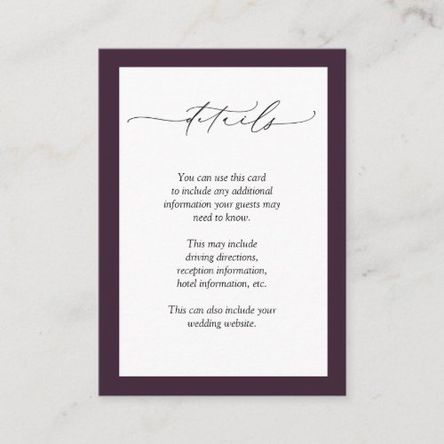
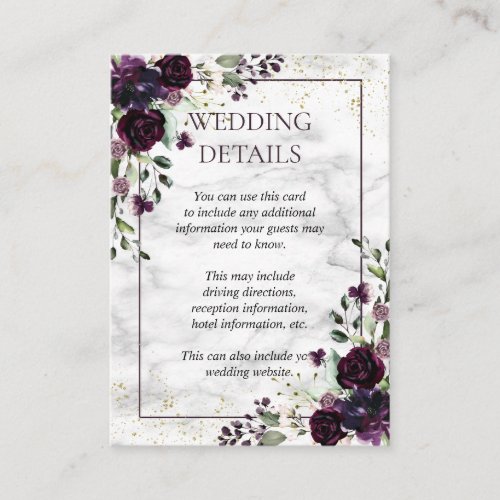
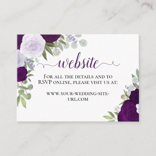
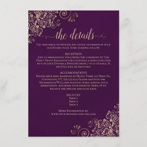
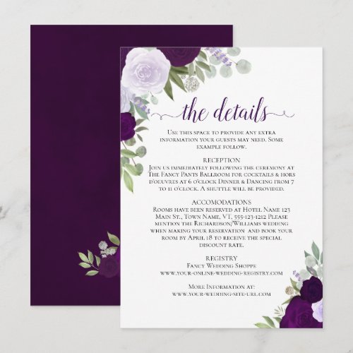
Details Cards
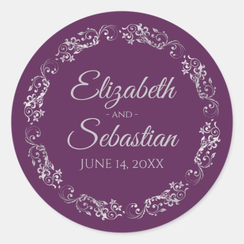
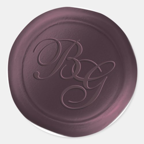
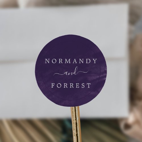
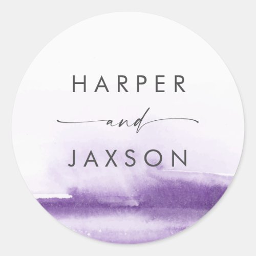
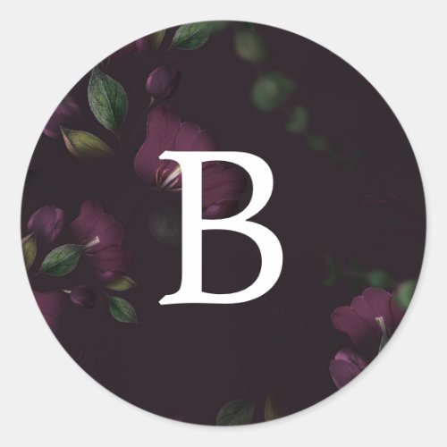
Envelope Seals
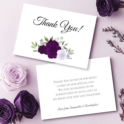
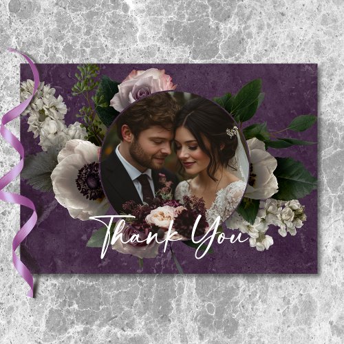
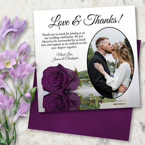
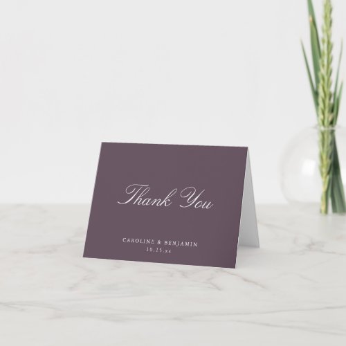
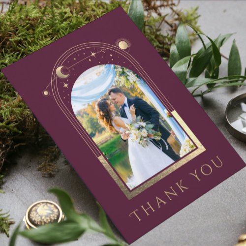
Thank You Cards
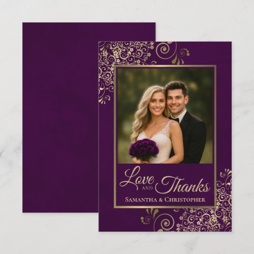
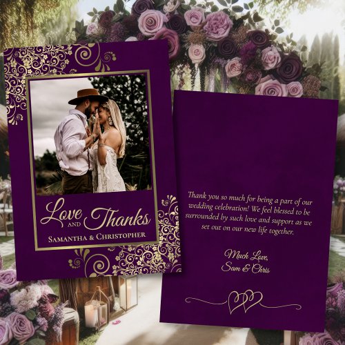

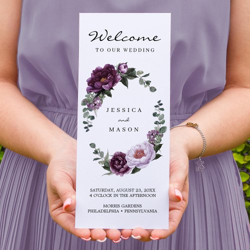
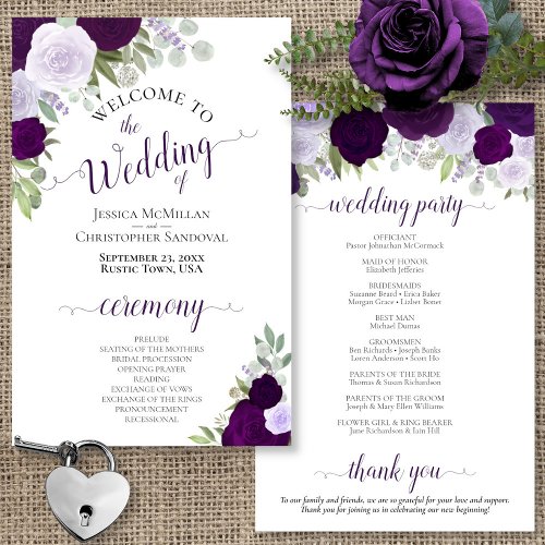
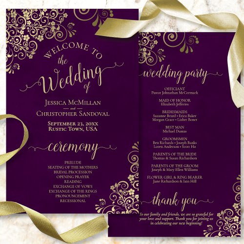
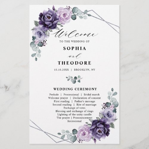
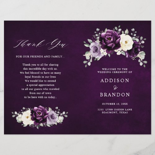
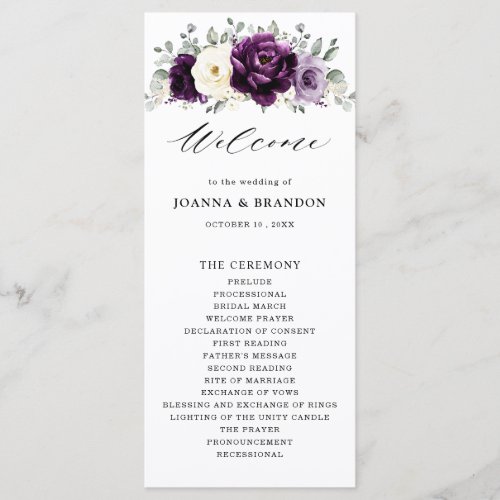
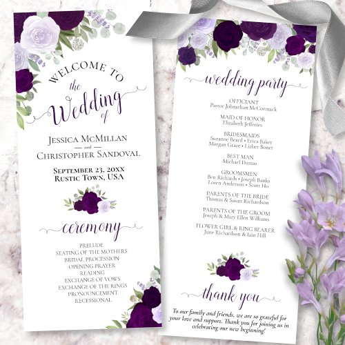
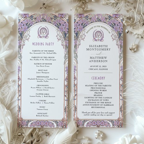
Programs
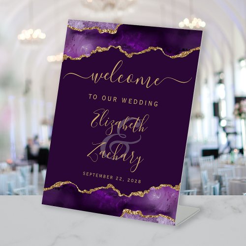
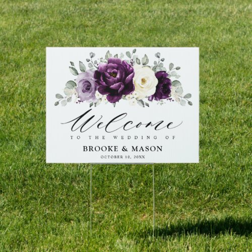
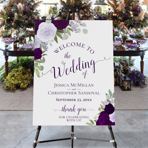
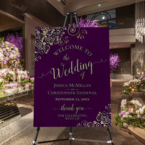
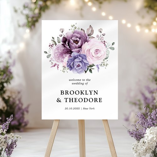
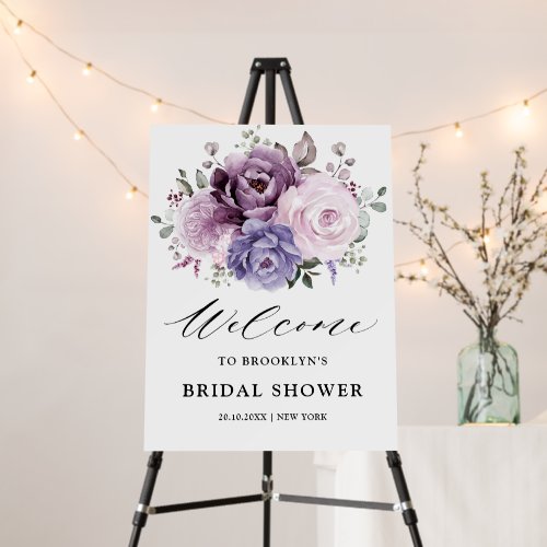
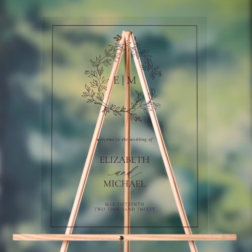
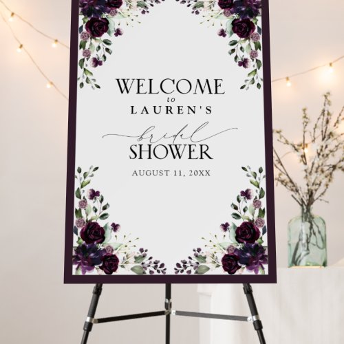
Welcome Signs
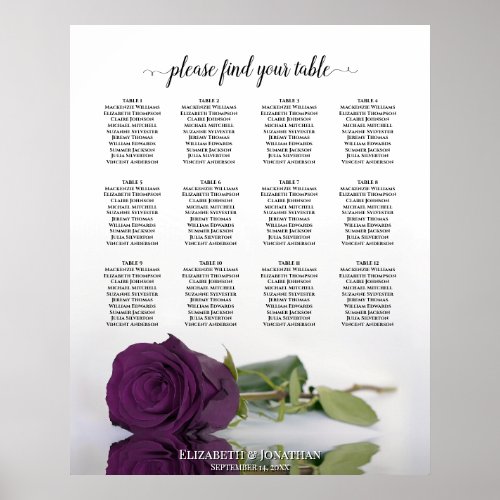
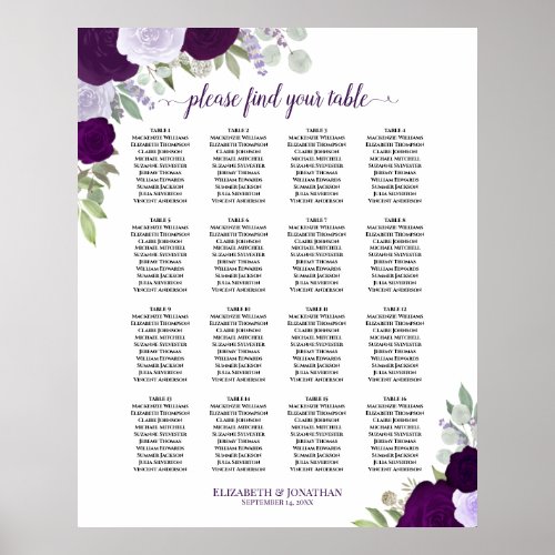
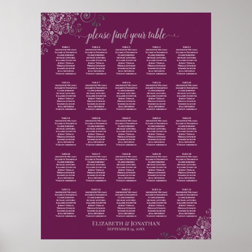
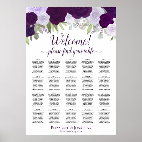
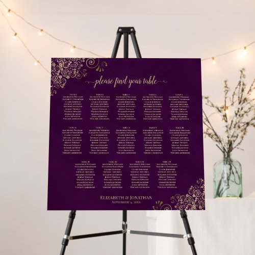
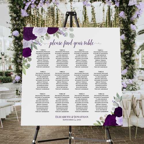
Seating Charts
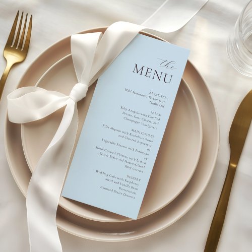
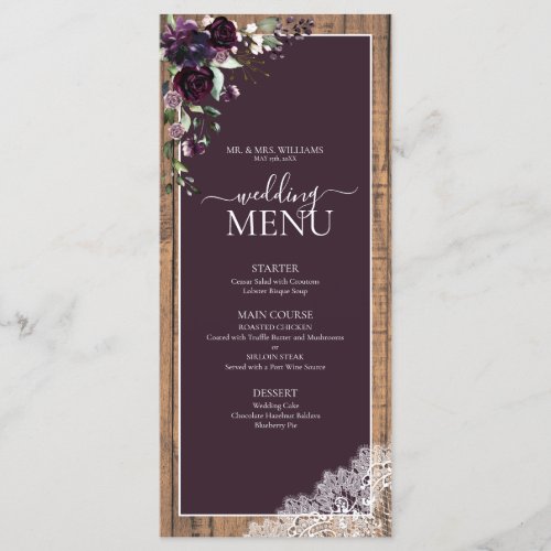
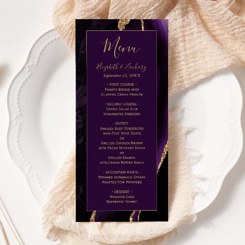
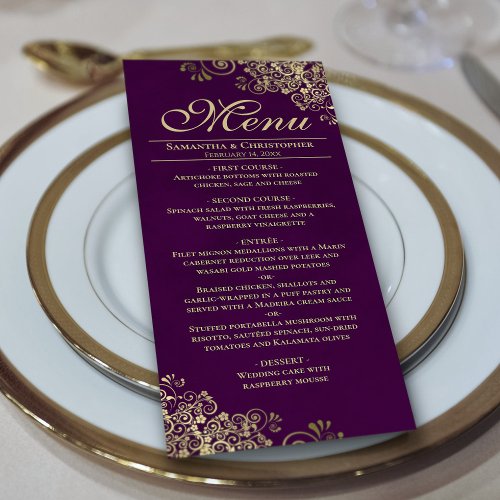
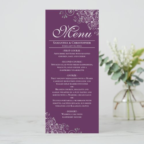
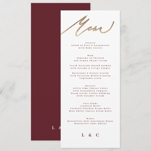
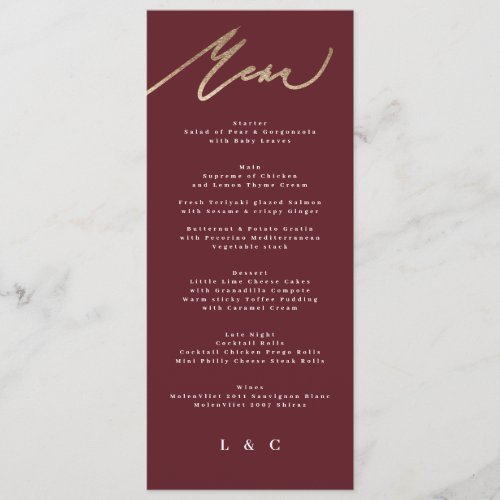
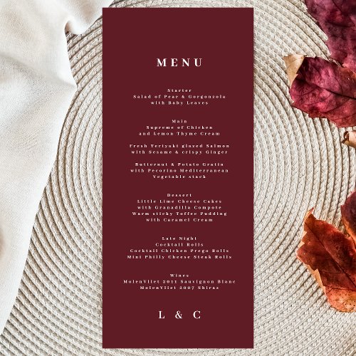
Menus
Place Cards
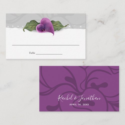
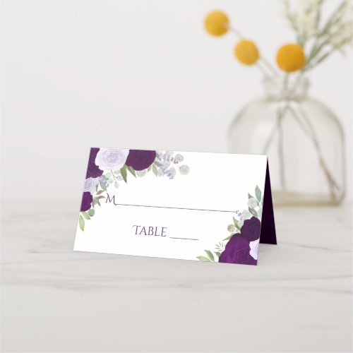
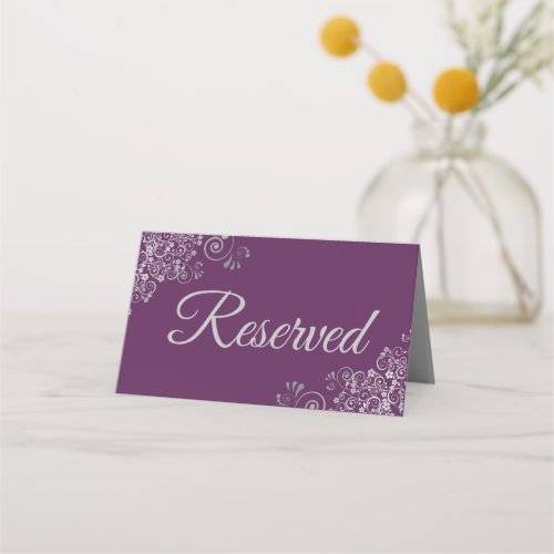
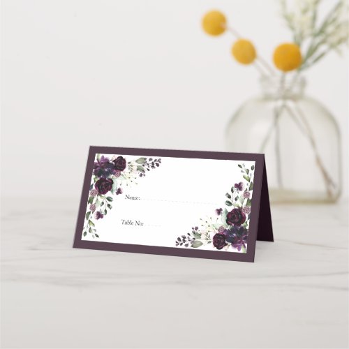
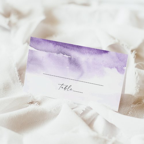
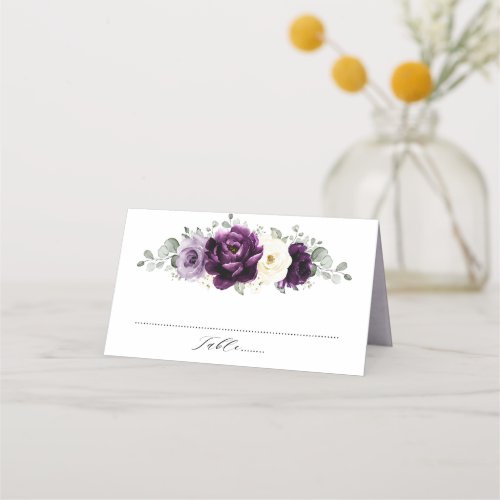
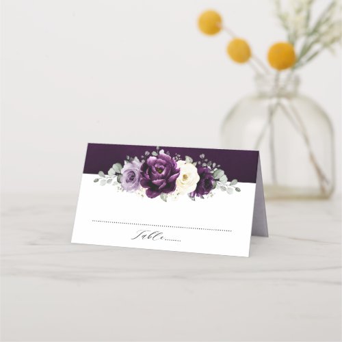
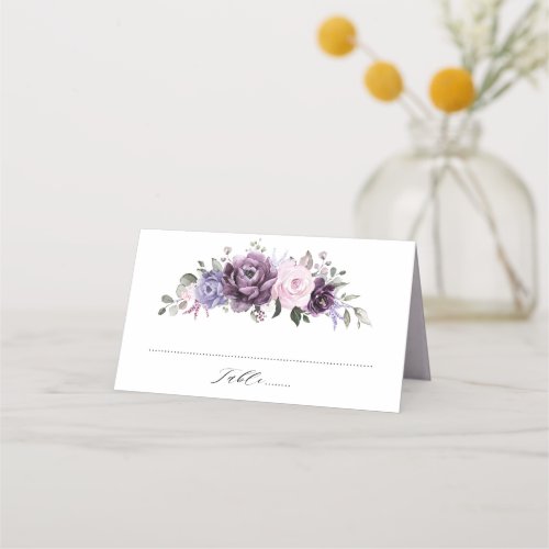
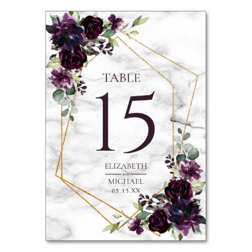
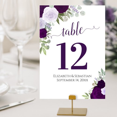
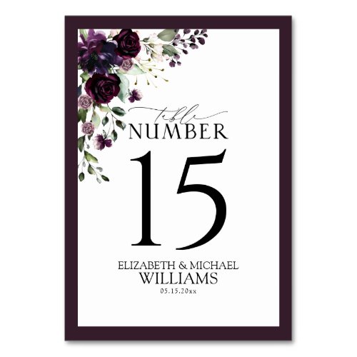
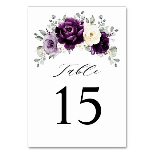
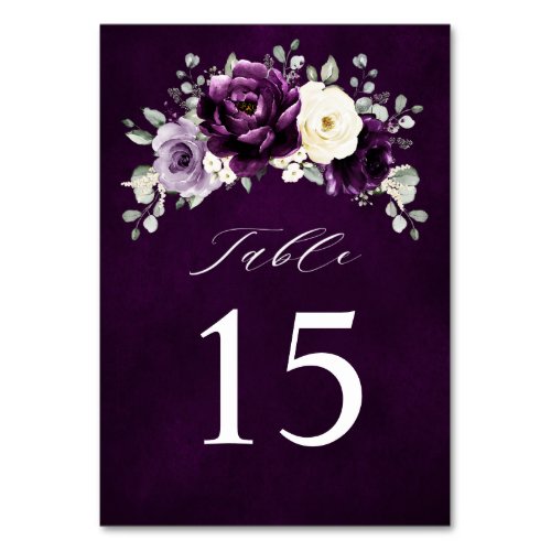
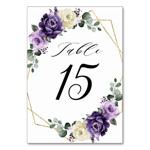
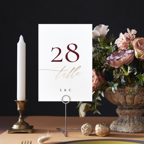
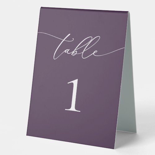
Table Numbers
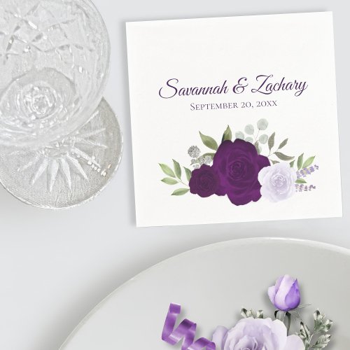
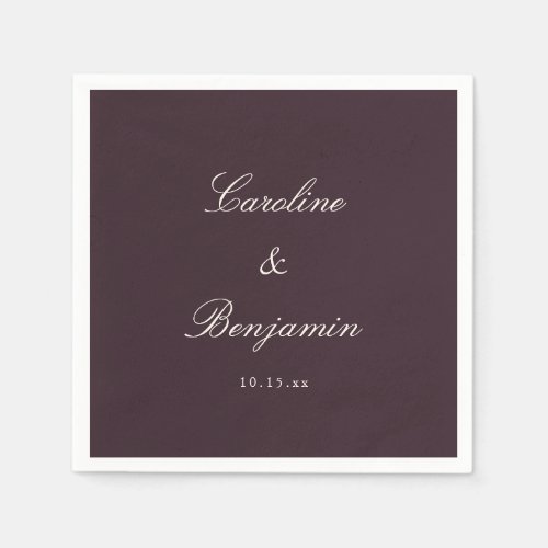
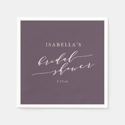
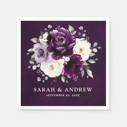
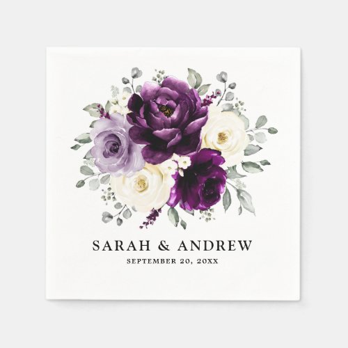
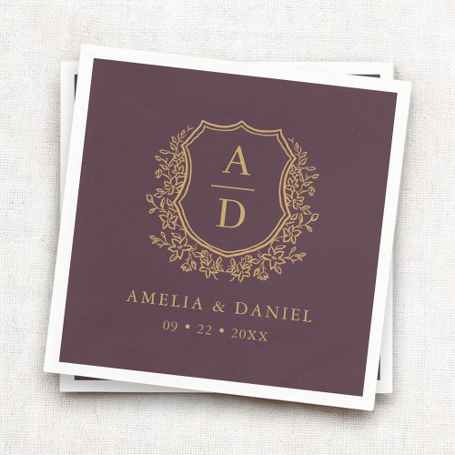
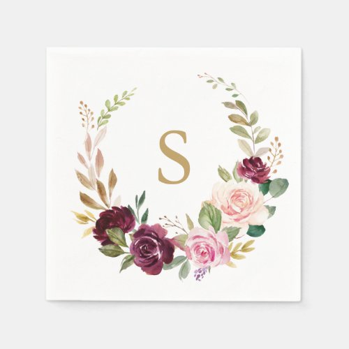
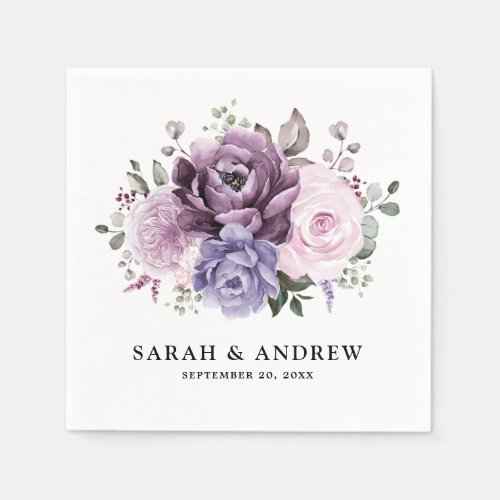
Napkins
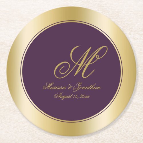
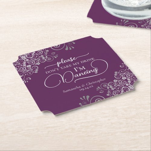
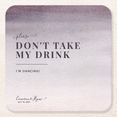
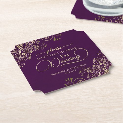
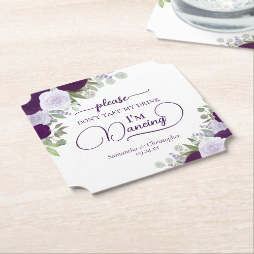
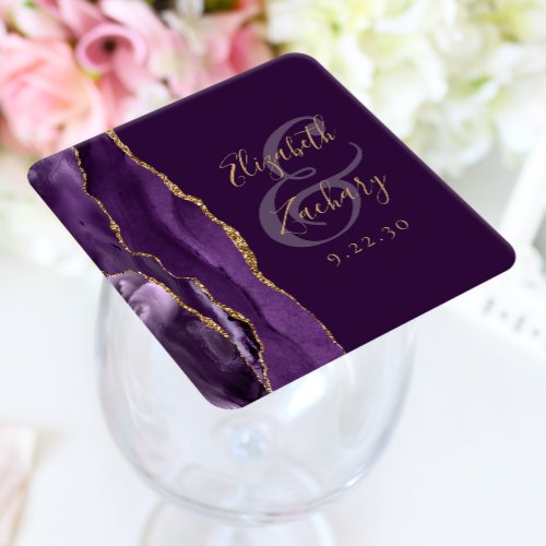
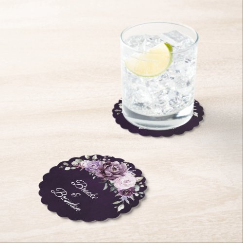
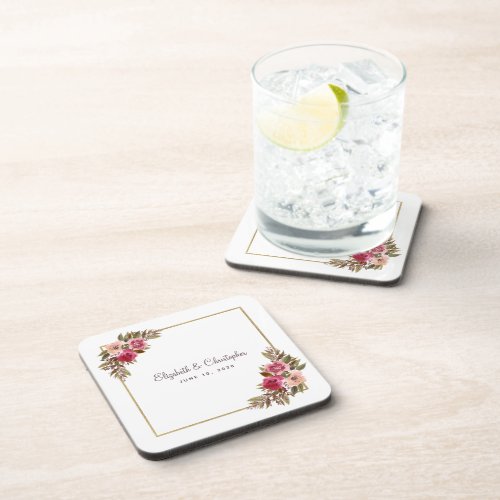
Coasters
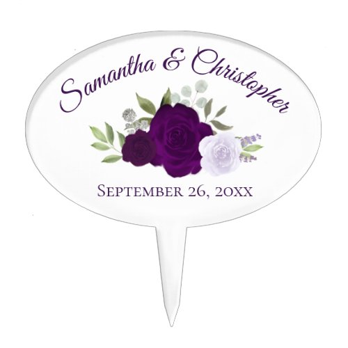
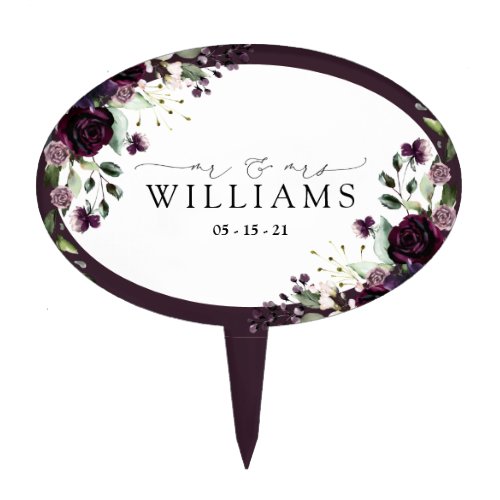
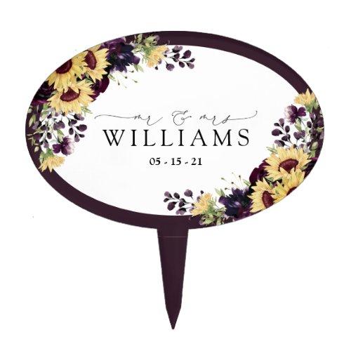
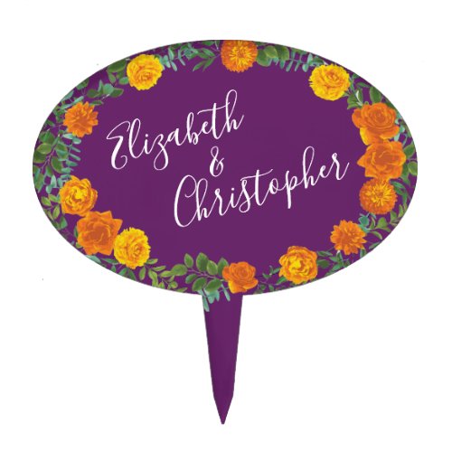
Cake Toppers
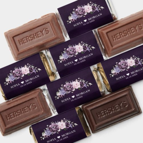
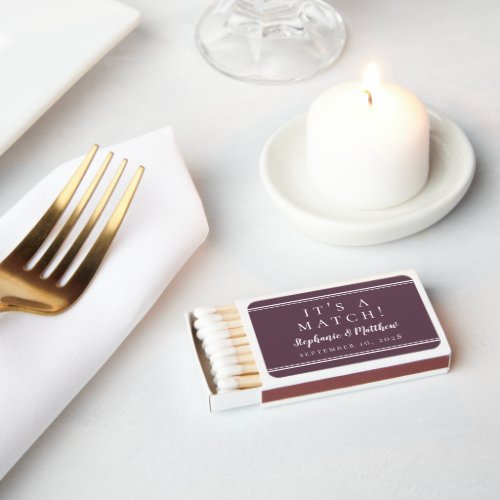
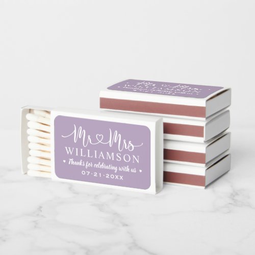
Favors
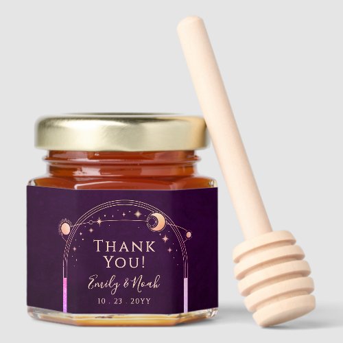
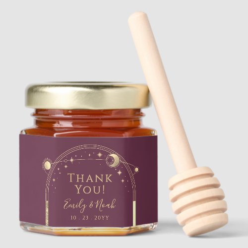
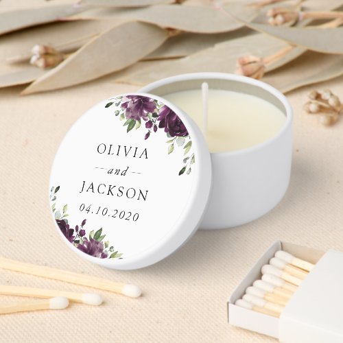
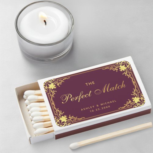
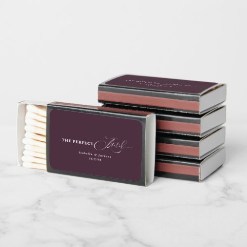
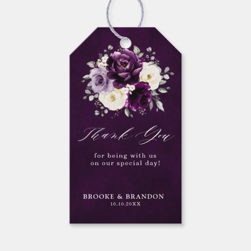
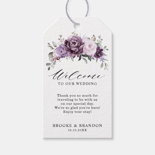
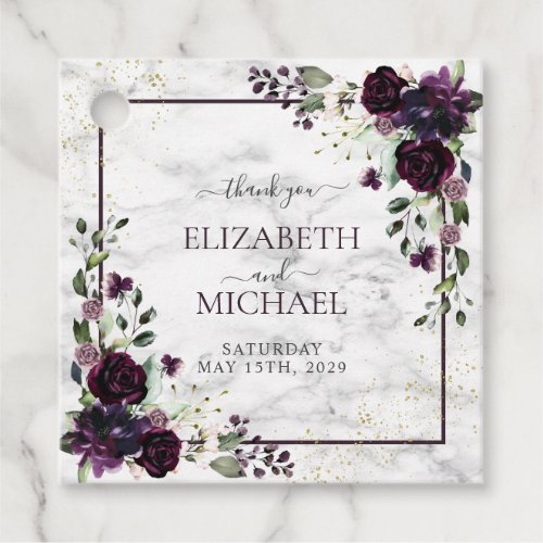
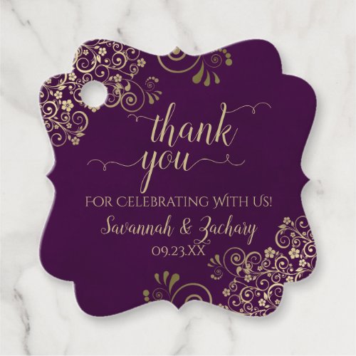
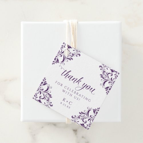
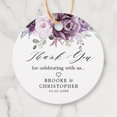
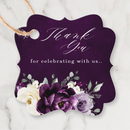
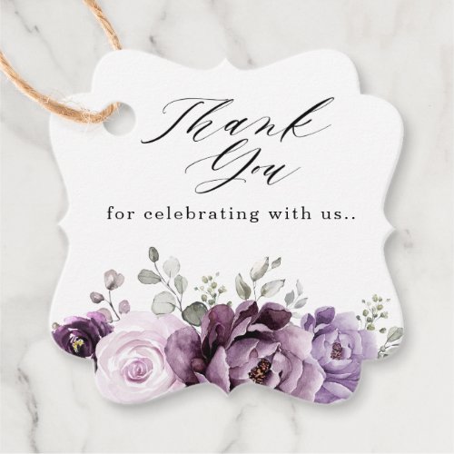
Favor Tags
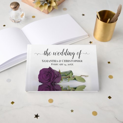
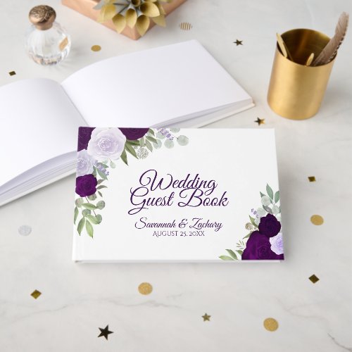
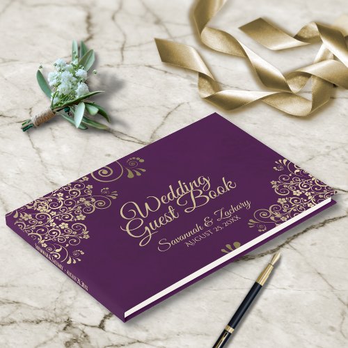
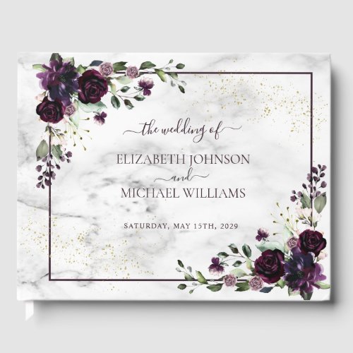
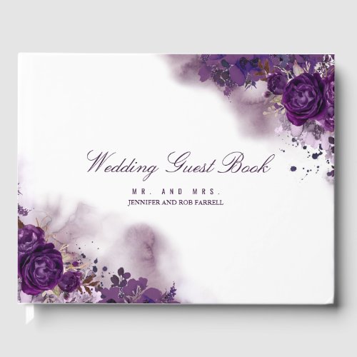
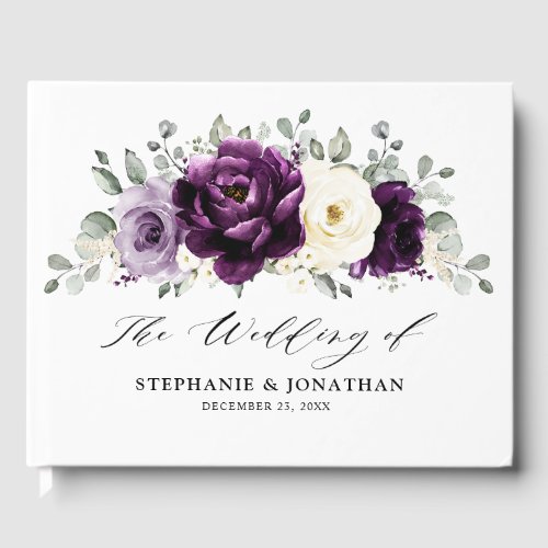
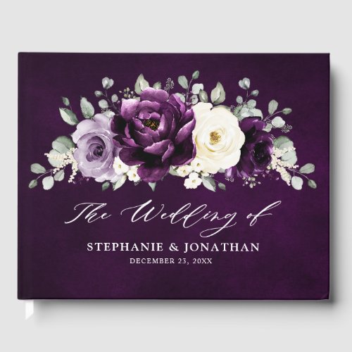
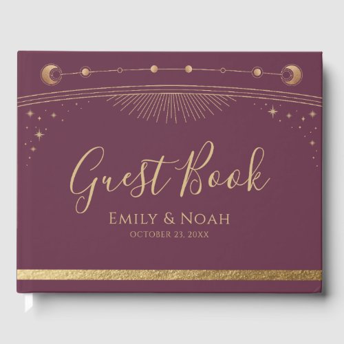
Guest Books
Affiliate links — at no cost to you. Prices shown are from Zazzle as of July 2026 and may change.
Styling tips
- Anchor plum with champagne or cream rather than white — the warm neutral stops the deep tones from reading heavy.
- Use plum on the printed pieces (invitations, menus, signage) and keep florals lighter with orchid and dusty berry, or the tables go dark fast.
- Plum loves candlelight. Budget for more candles than you think and skip cool-white uplighting, which turns the berry tones grey.
Frequently asked questions
What colors go with plum for a wedding?
Champagne, cream and soft gold are the safest partners — they warm plum without competing. For something less classic, try sage or eucalyptus for contrast, or layer orchid and dusty berry for a tonal, all-plum look.
Is plum a fall or winter wedding color?
Both. Plum with champagne and dried florals reads autumnal, while plum with silver, deep green and heavy candlelight leans winter. The same hex codes carry either season — the metals and greenery decide.
Is plum too dark for a daytime wedding?
Not if you balance it. Use plum as the accent on stationery and linens against a cream base rather than as the dominant colour, and add orchid or blush florals to lift it in daylight.