Chocolate Brown Wedding
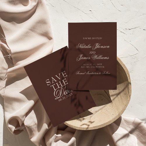
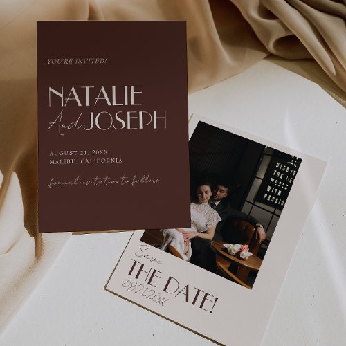
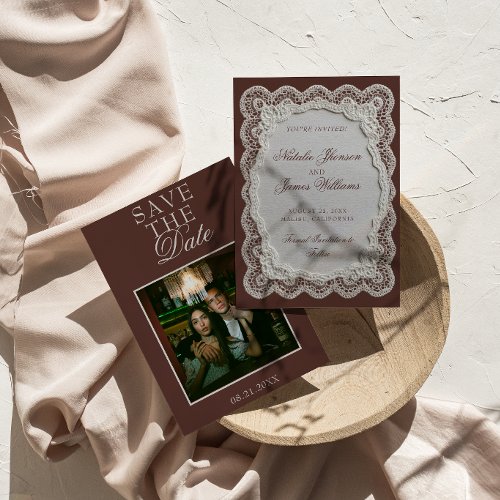
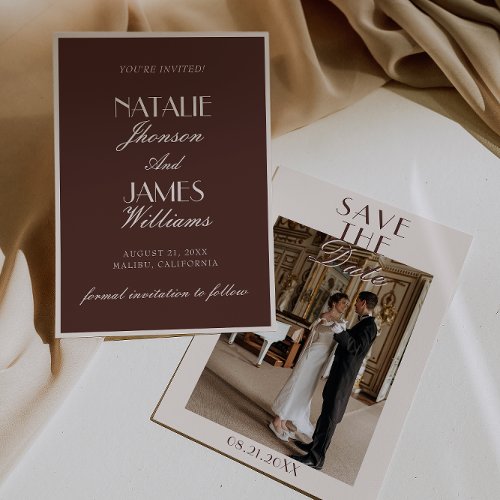
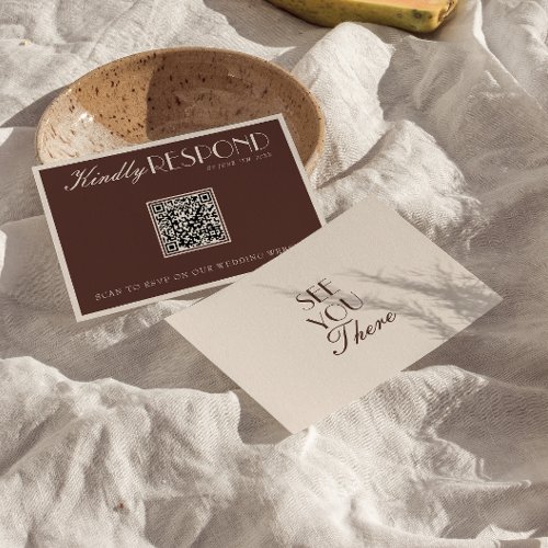
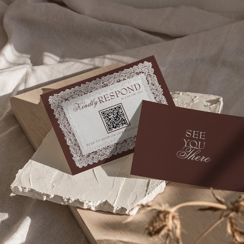
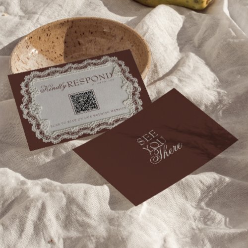
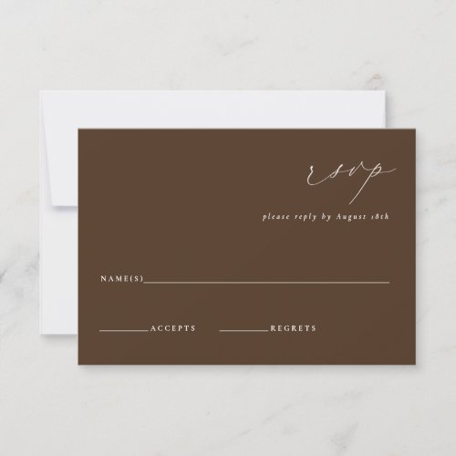
Chocolate brown is the palette that has quietly taken over from grey and greige as the elevated neutral. Espresso and cocoa tones layered with caramel and cream feel warm rather than austere, and they do something no true neutral manages: they look expensive in low light. It is a natural fit for autumn and winter receptions, candlelit dinners and anywhere with wood or leather in the room. These are the exact hex codes, with matching stationery, signage and table details in the same shades.
Where to shop this palette
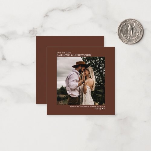
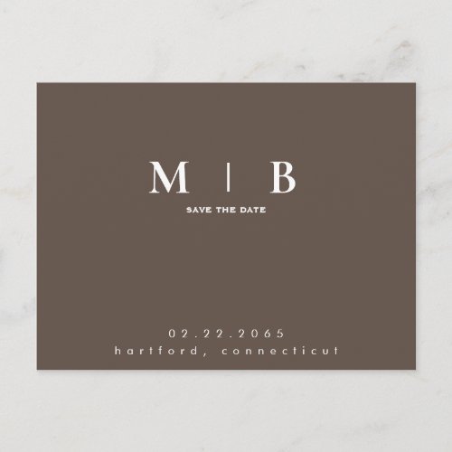
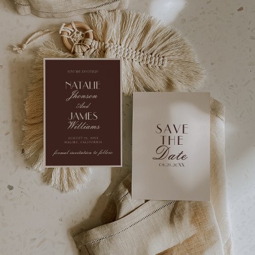
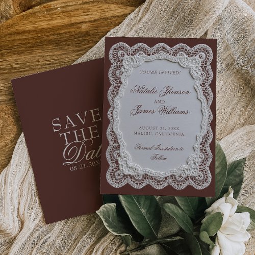
Save the Dates
Invitations
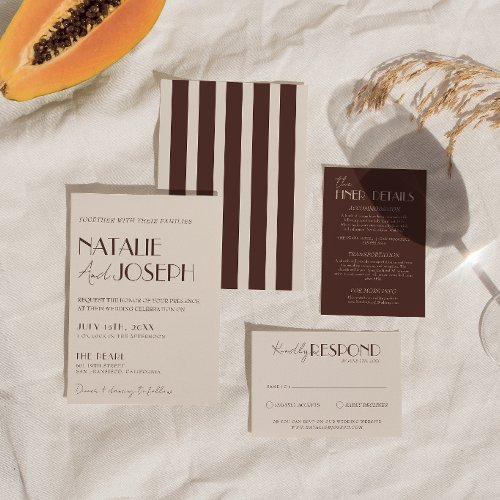
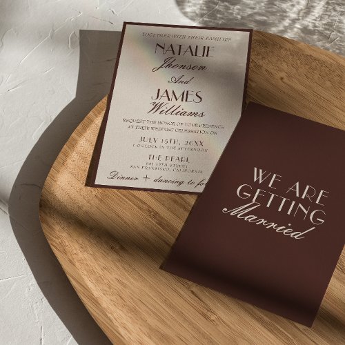
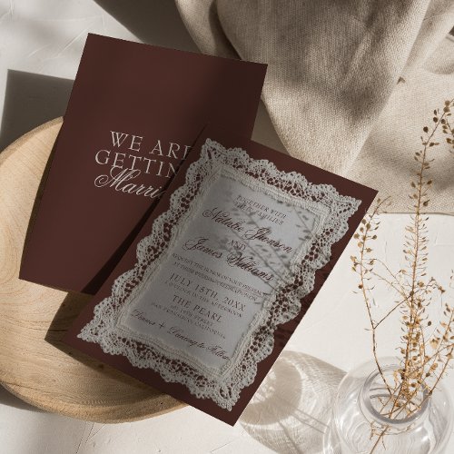
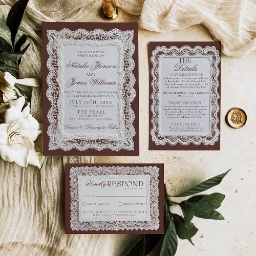
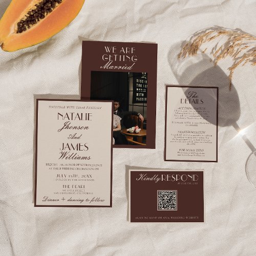
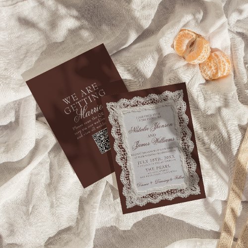
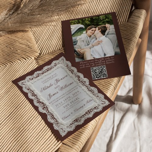
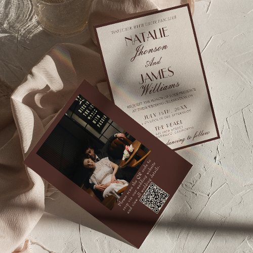
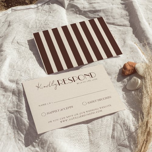
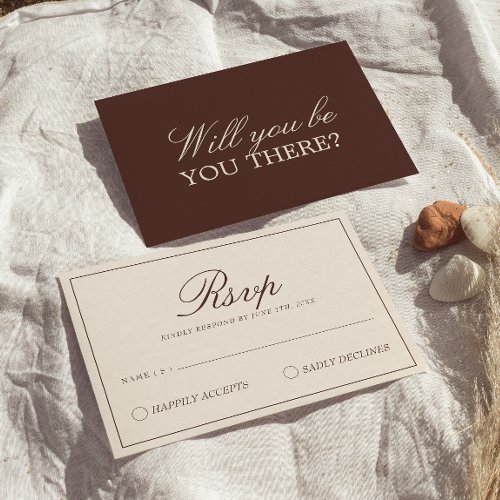
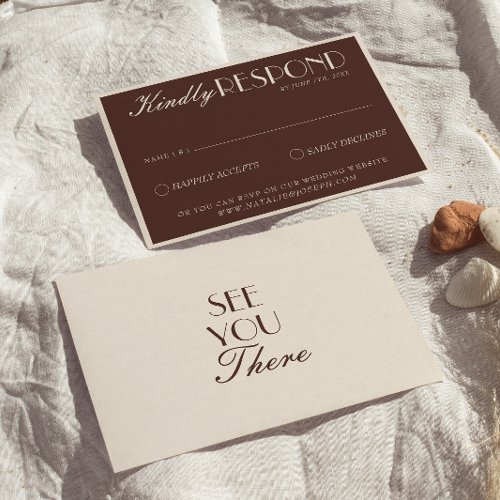
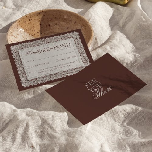
RSVP Cards
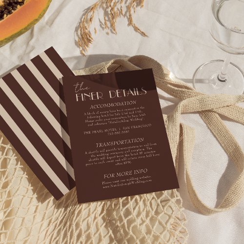
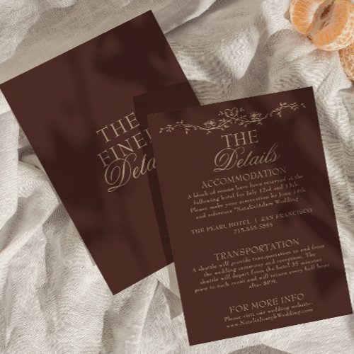
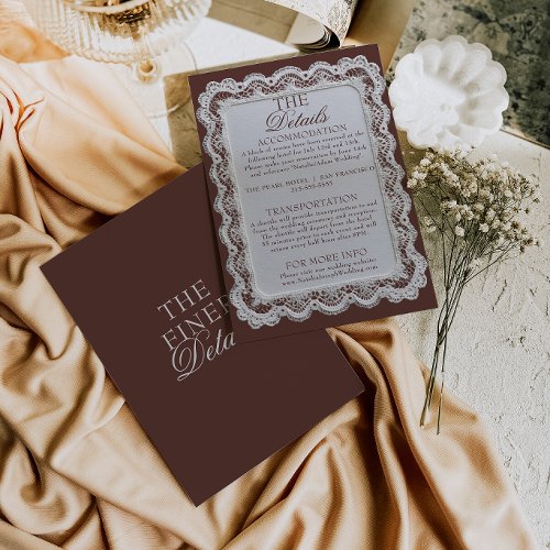
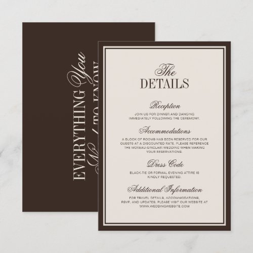
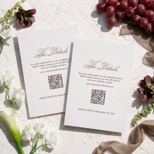
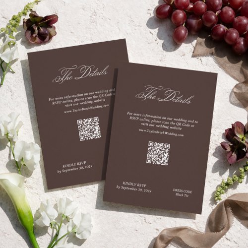
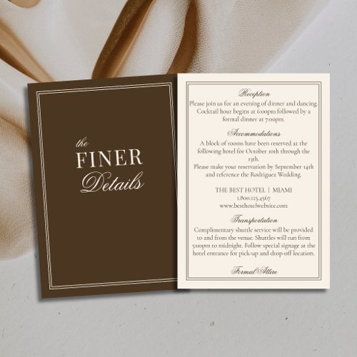
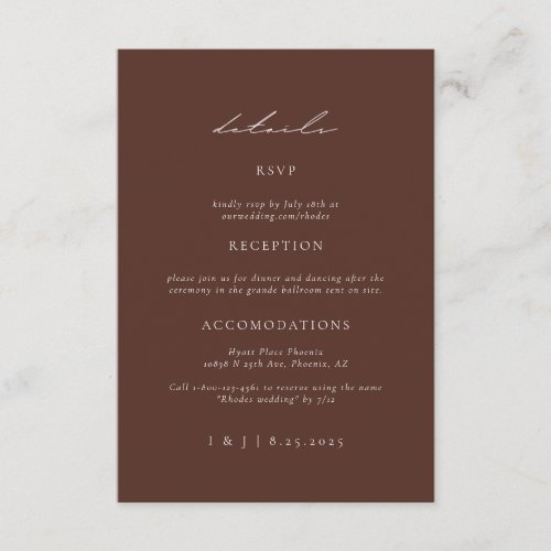
Details Cards
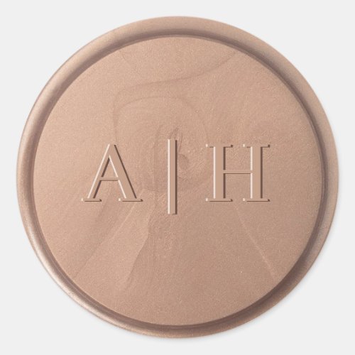
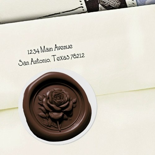
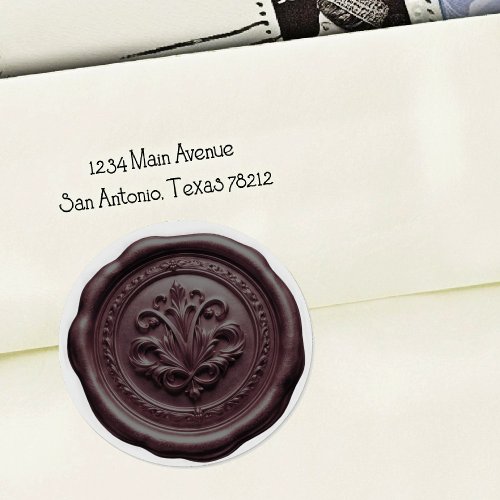
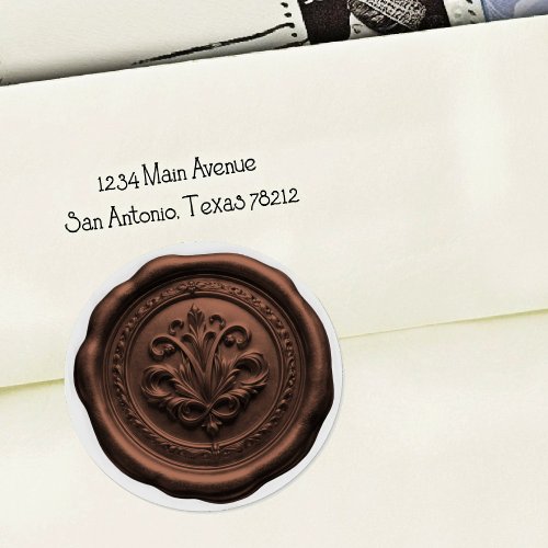
Envelope Seals
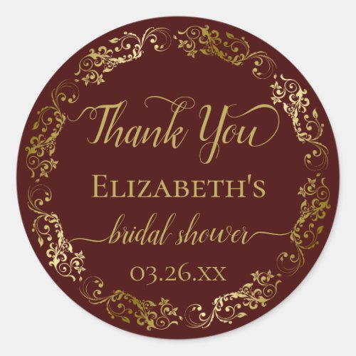
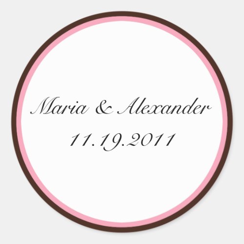
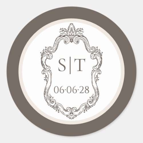
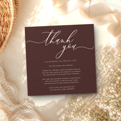
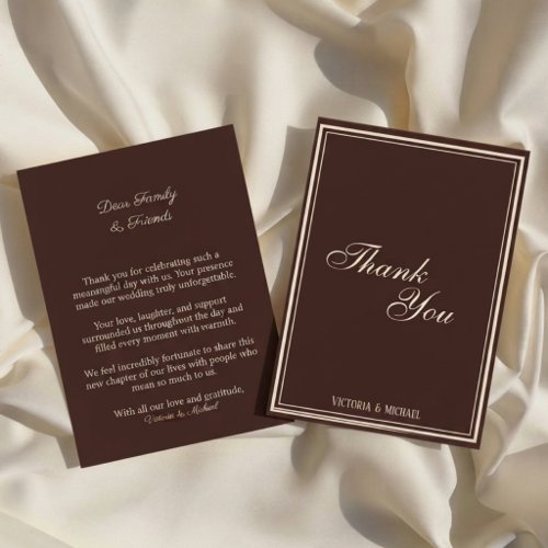
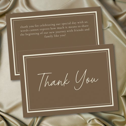
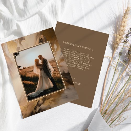
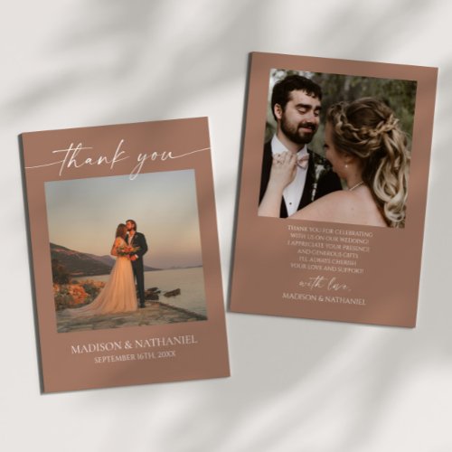
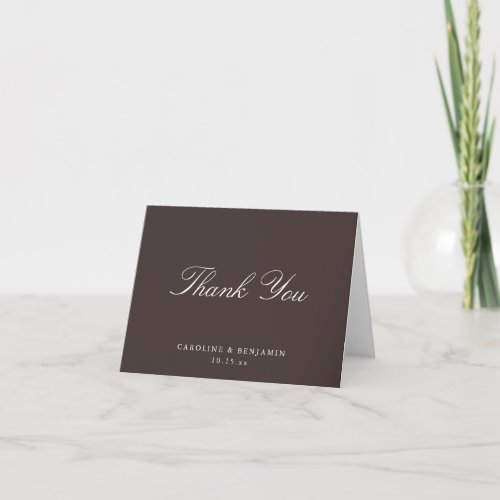
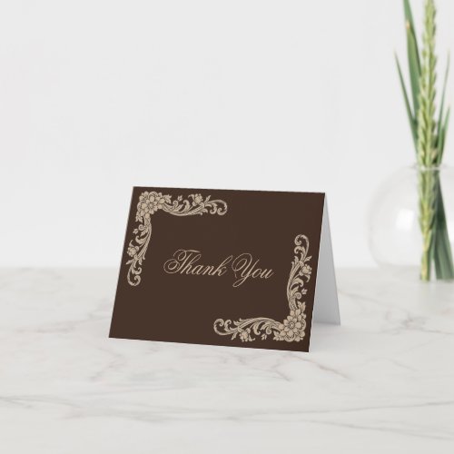
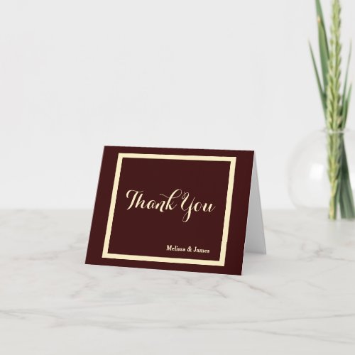
Thank You Cards
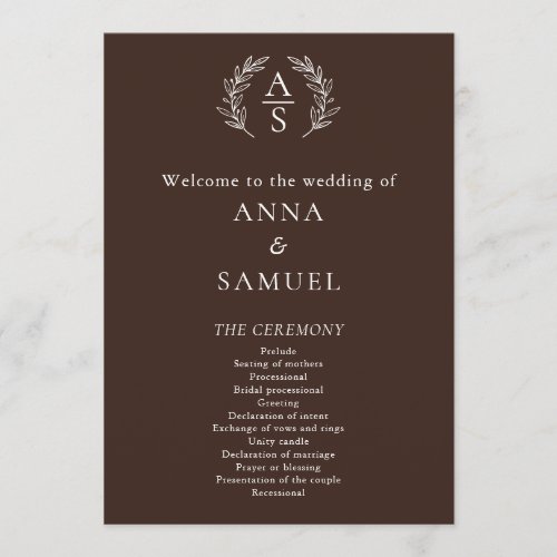
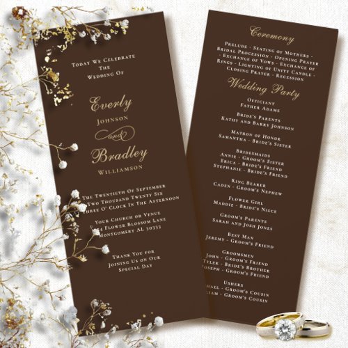
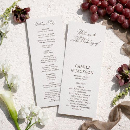
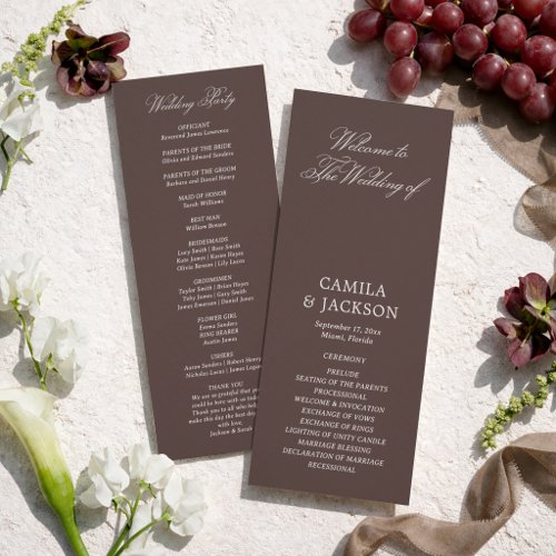
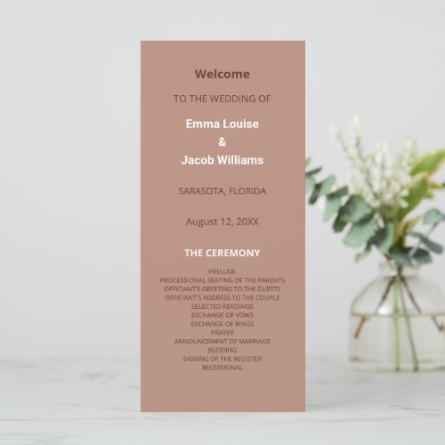
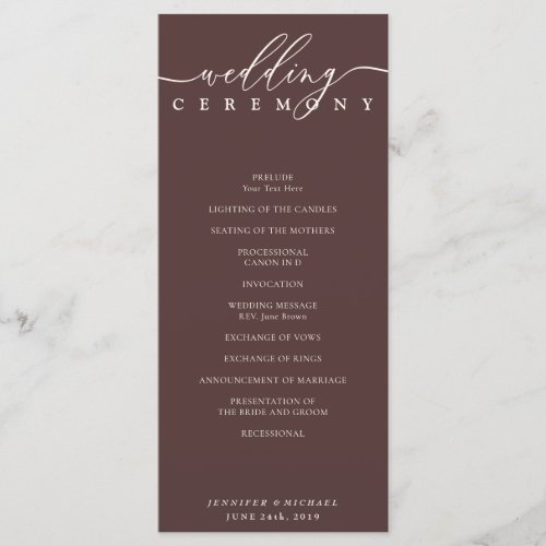
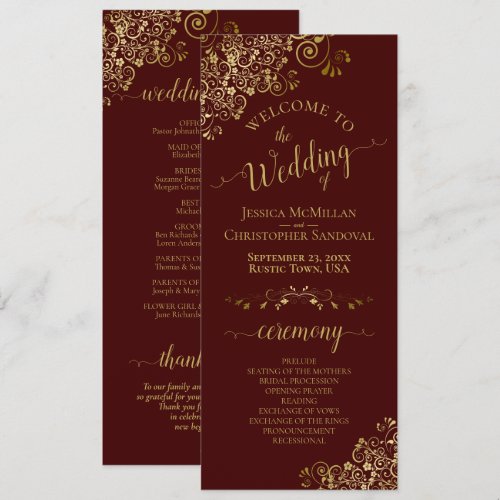
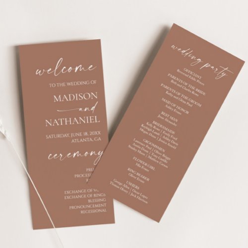
Programs
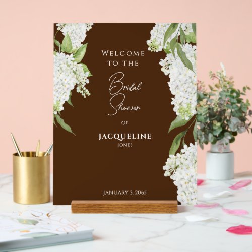
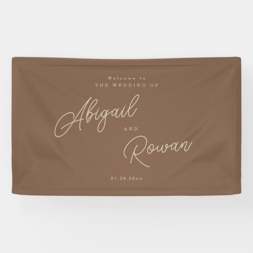
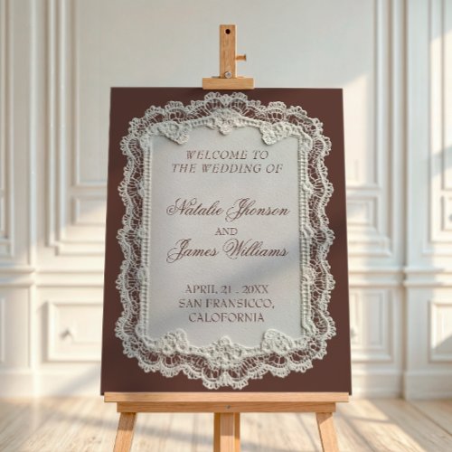
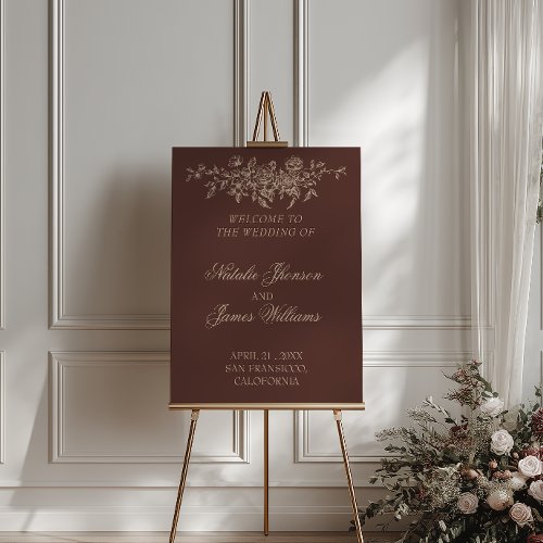
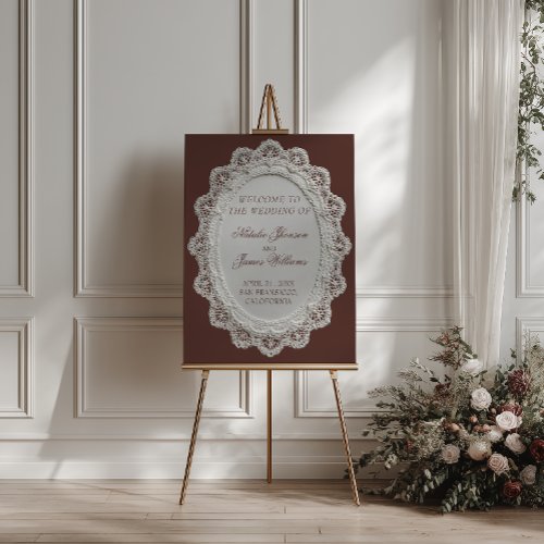
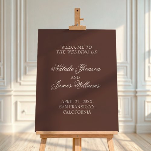
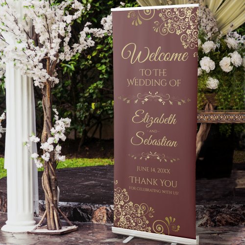
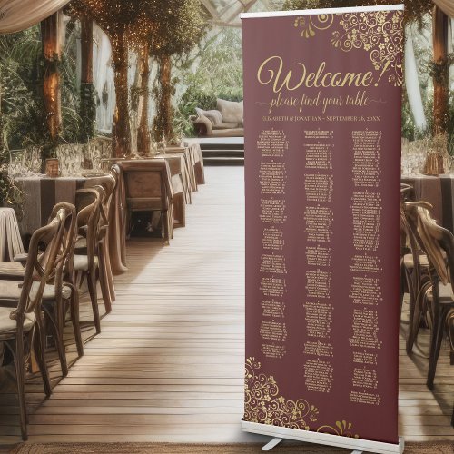
Welcome Signs

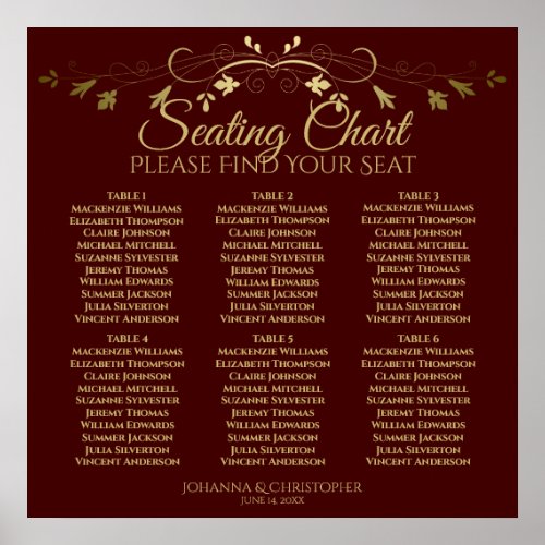
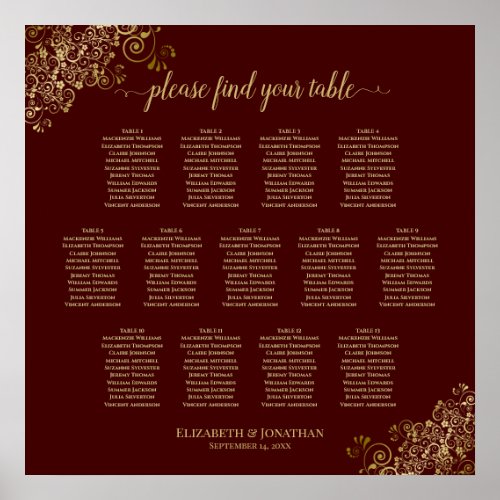
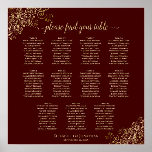
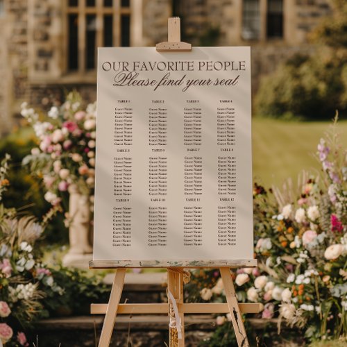
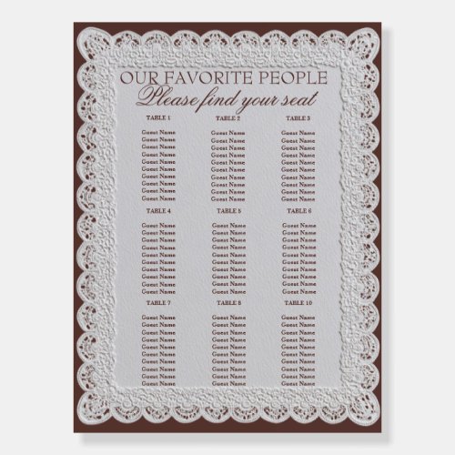
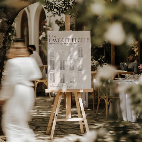
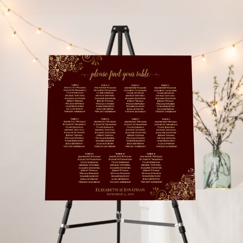
Seating Charts
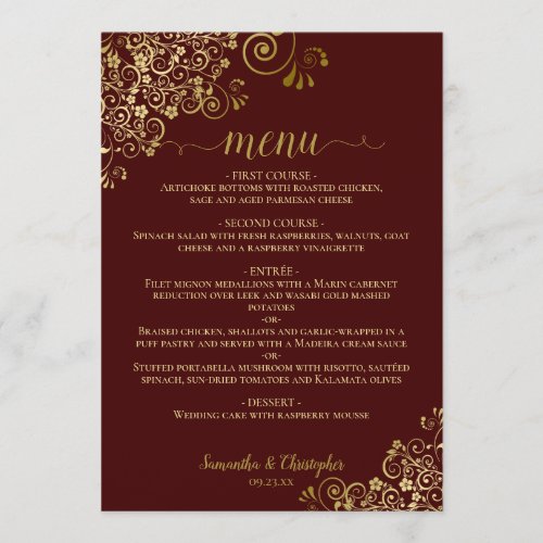
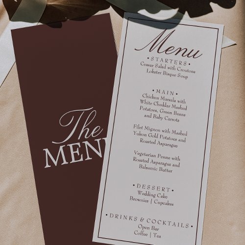
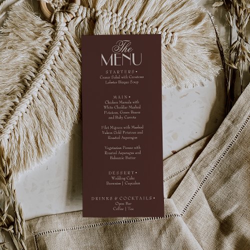
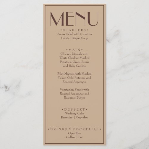
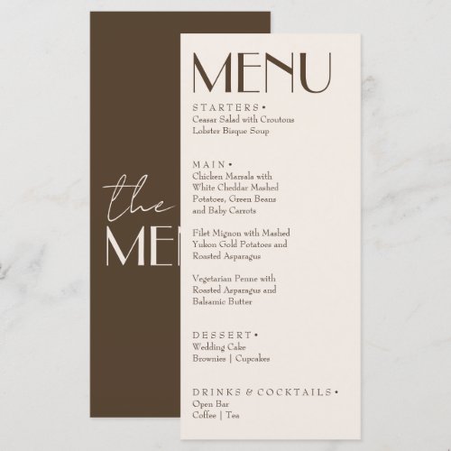
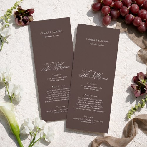
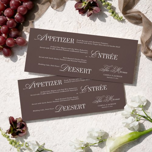
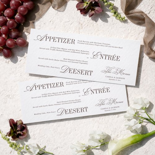
Menus
Place Cards
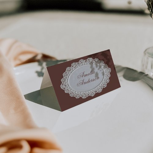
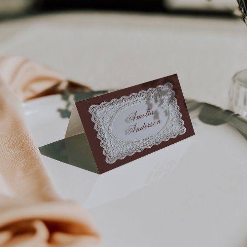
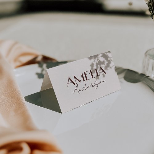
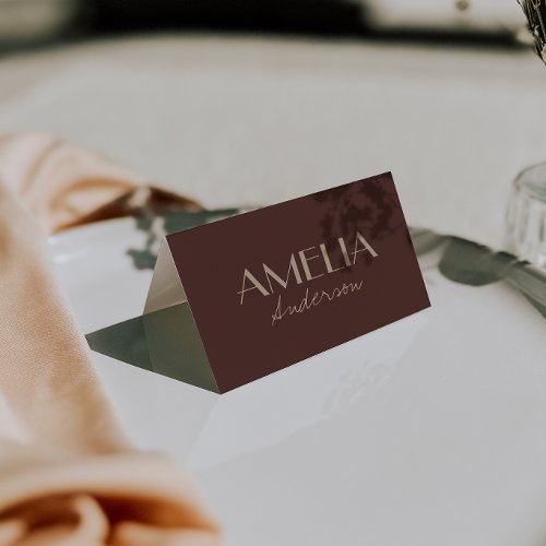
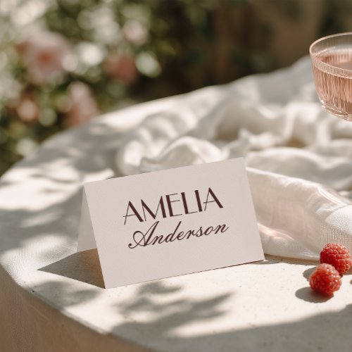
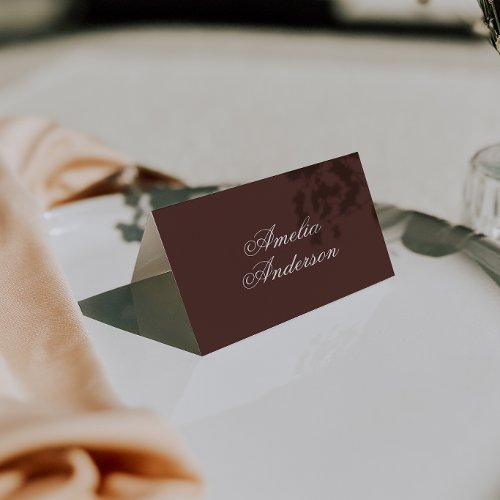
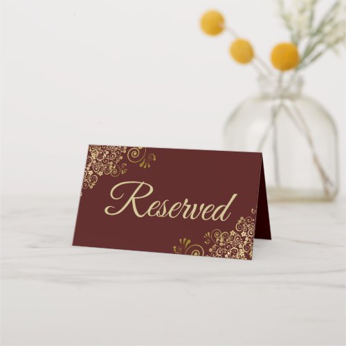
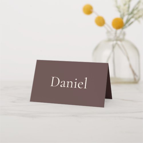
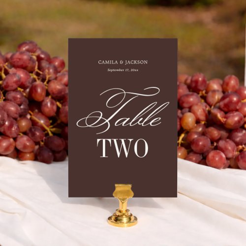
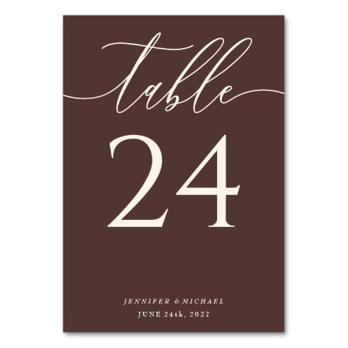
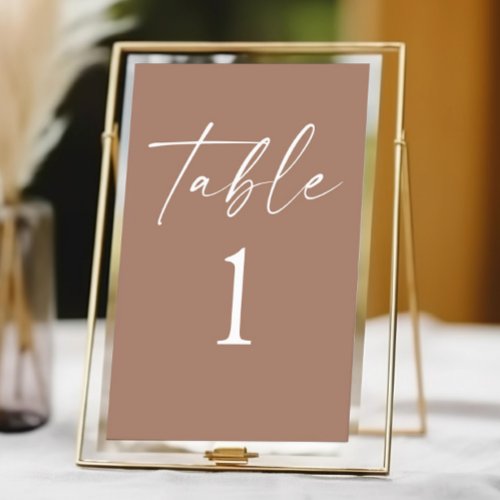
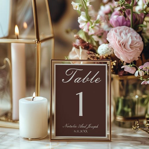
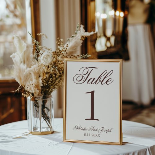
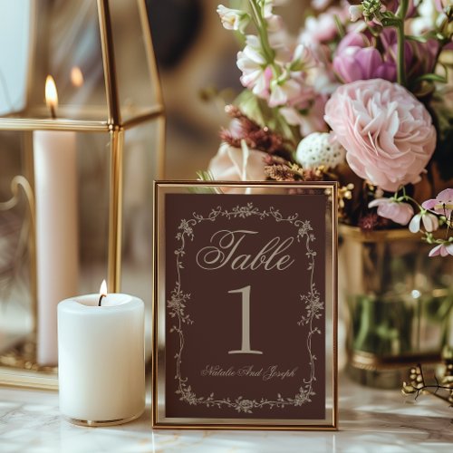
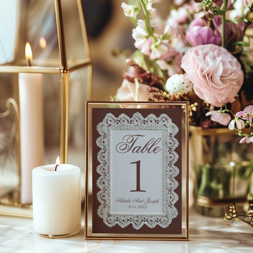
Table Numbers
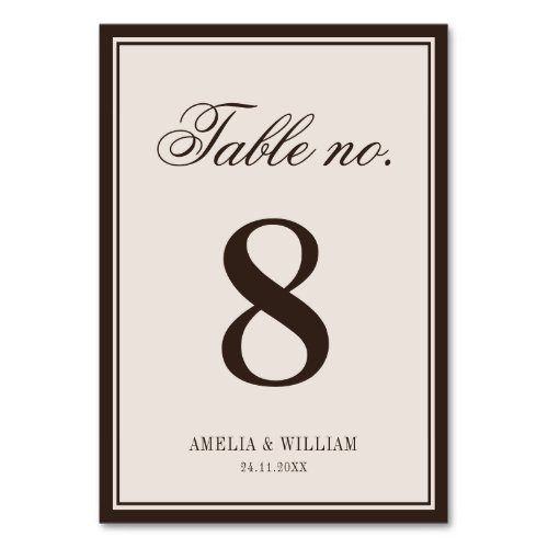
Napkins
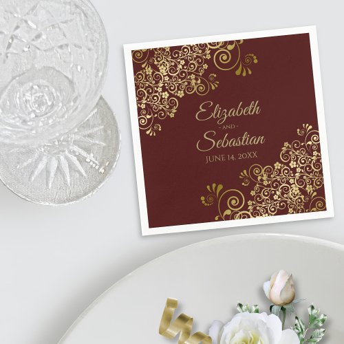
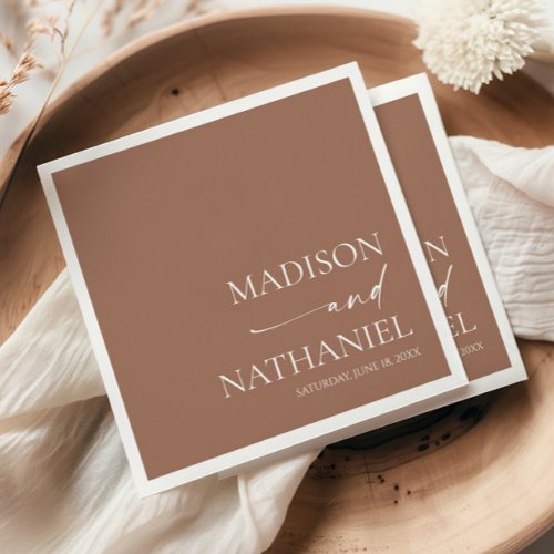
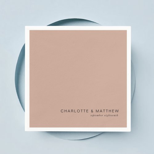
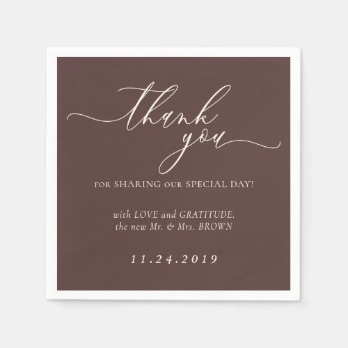
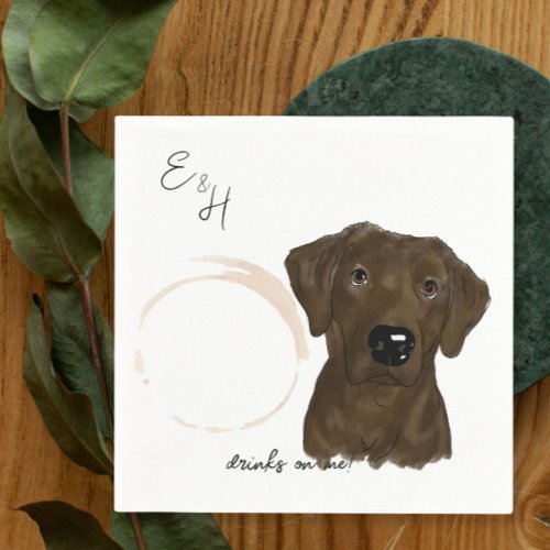

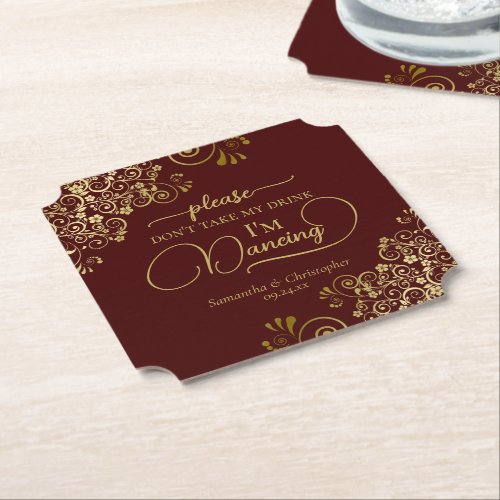
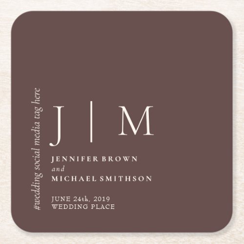
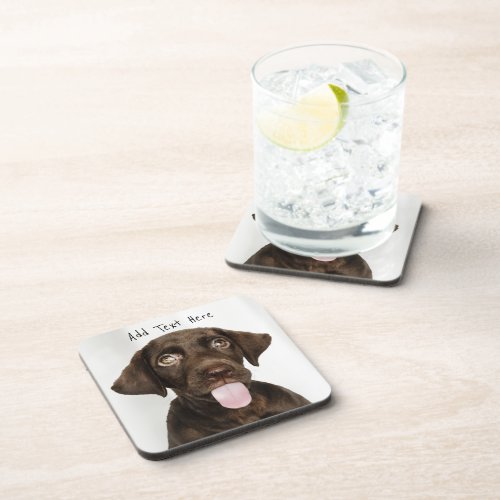
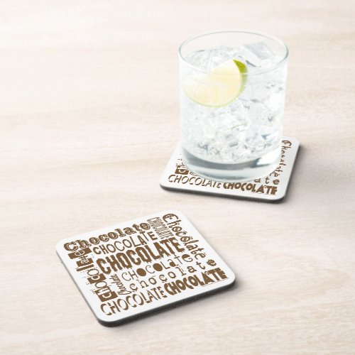
Coasters
Favors
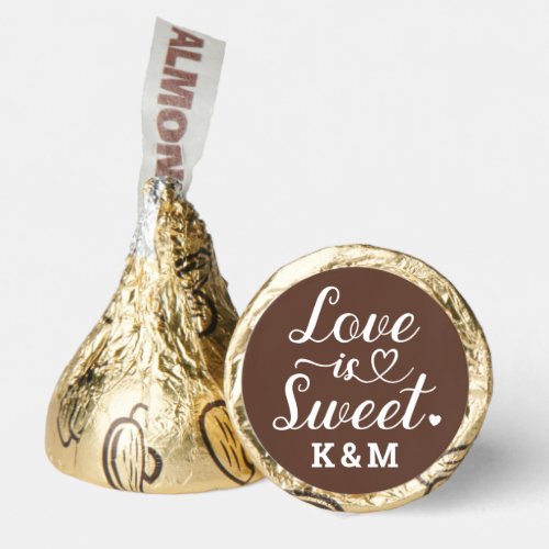
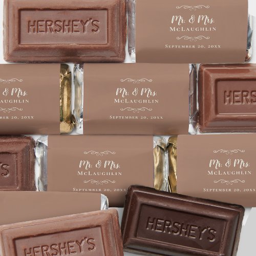
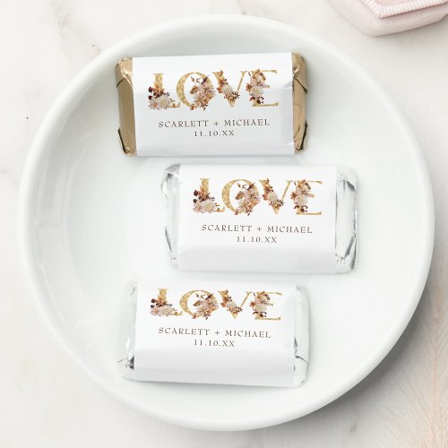
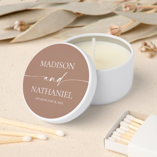
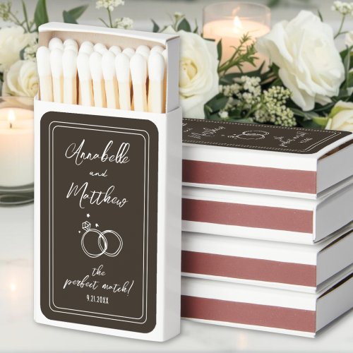
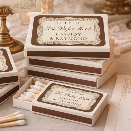
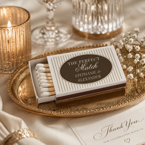
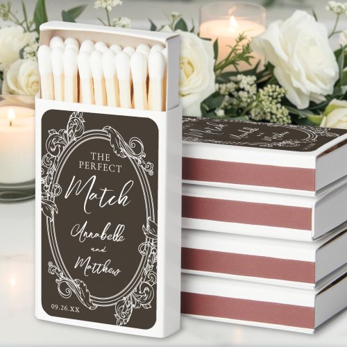
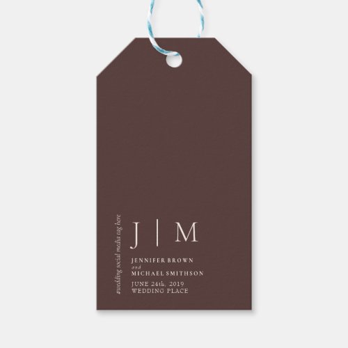
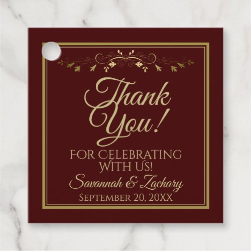
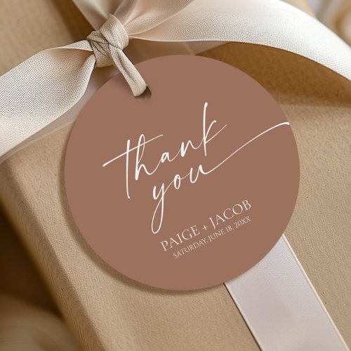
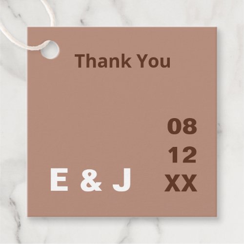
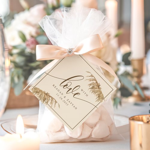
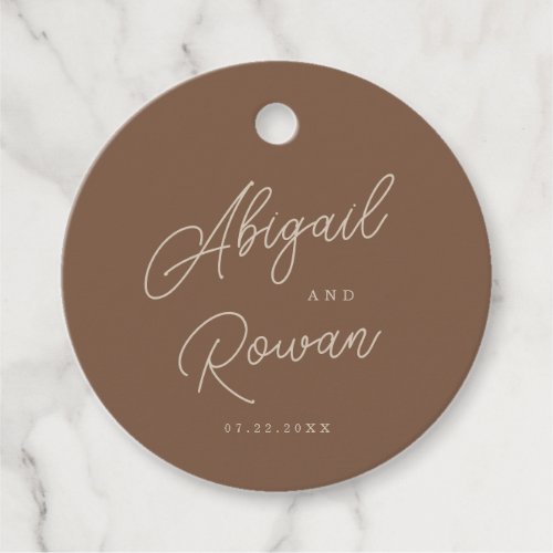
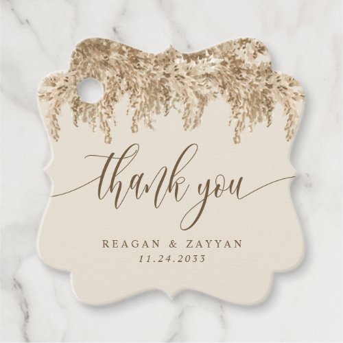
Favor Tags
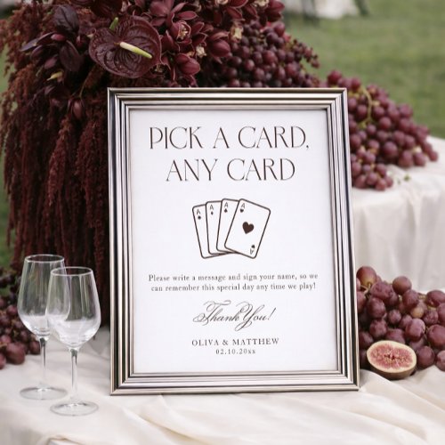
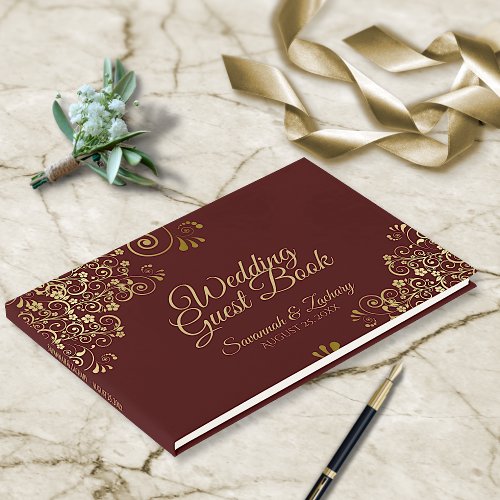
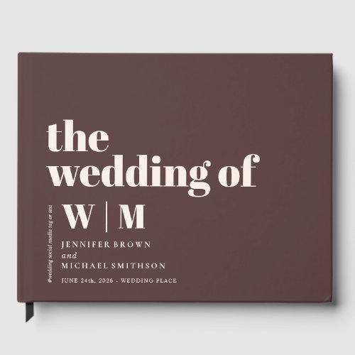
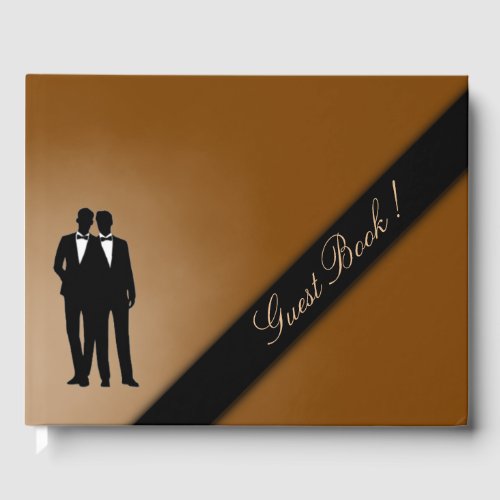
Guest Books
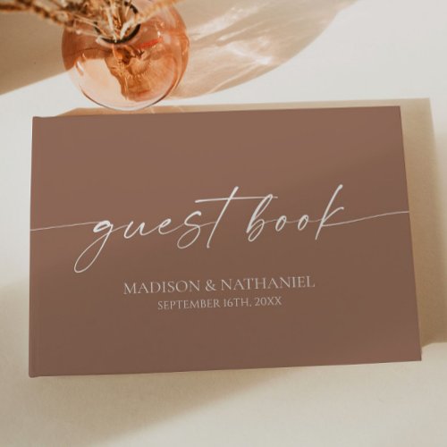
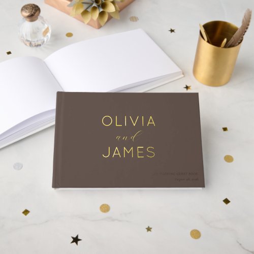
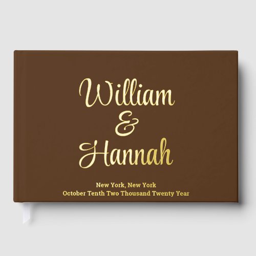
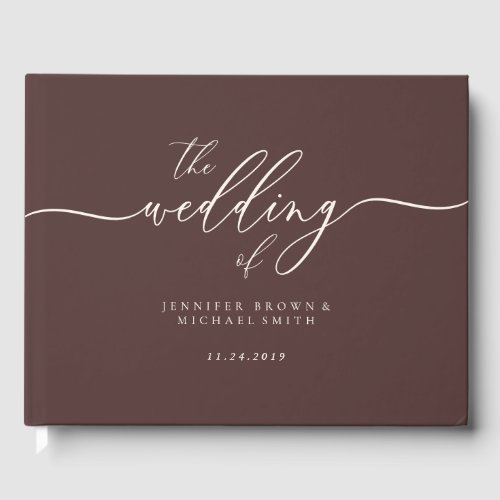
Affiliate links — at no cost to you. Prices shown are from Zazzle as of July 2026 and may change.
Styling tips
- Keep at least two light tones (latte and cream) in the mix — an all-brown table reads flat without something to bounce light.
- Brown loves texture more than pattern. Choose linen, velvet and matte card stock over printed motifs and the palette does the work itself.
- Add cream or white florals rather than coloured ones. Against chocolate, pale blooms read crisp; bright colours fight the neutral.
Frequently asked questions
What colors go with chocolate brown for a wedding?
Cream, latte and caramel keep it tonal and modern. For contrast, add dusty blue or sage for something cooler, or butter yellow and terracotta to push it warmer. Gold hardware suits it better than silver.
Is brown a good wedding color?
It has become one of the most requested palettes going into 2027. Chocolate and espresso read as a warm alternative to grey — sophisticated in photos, forgiving in candlelight, and easy to match with wood and greenery venues.
What season is a chocolate brown wedding best for?
Autumn and winter suit it best, when the warmth works with the light. It can carry a summer wedding too if you lean on the lighter latte and cream end of the palette rather than the deep espresso tones.