Cherry Red Wedding
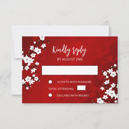
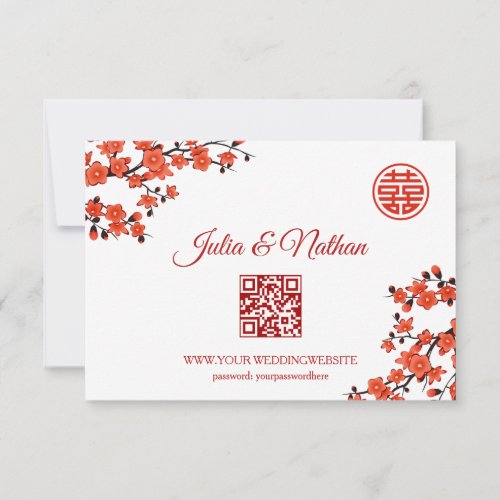
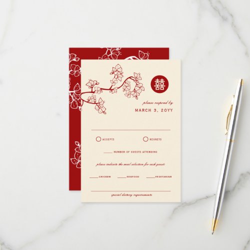
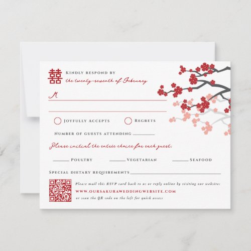
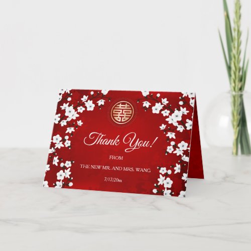
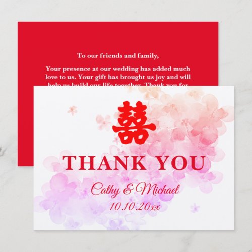
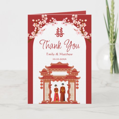
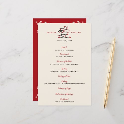
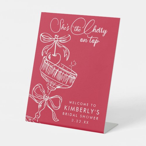
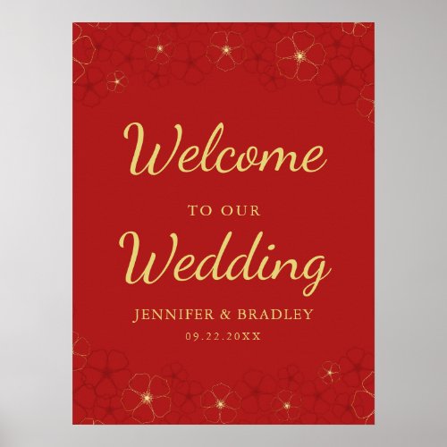
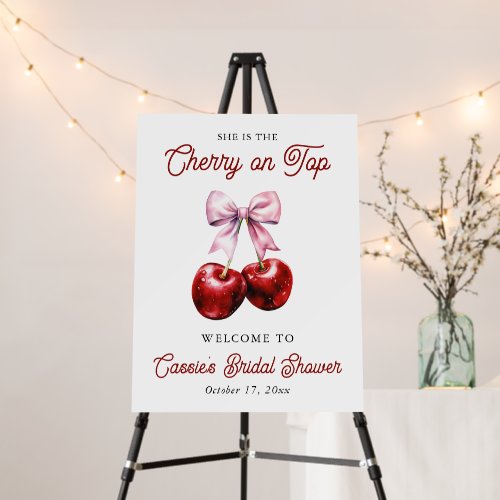
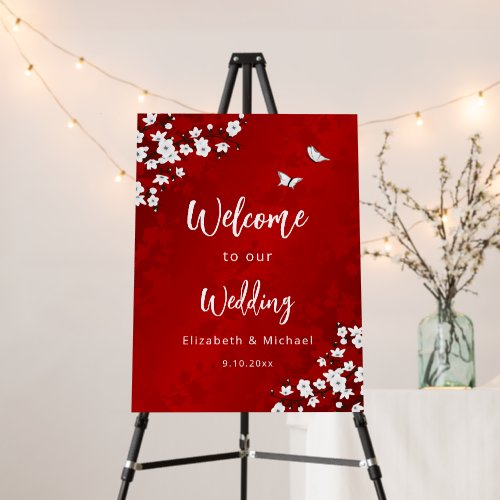
Cherry red is back, and it is louder and more confident than the burgundy that dominated the last few years. This is a true, bright red — festive without tipping into holiday kitsch, and dramatic enough that it needs very little else in the room to make an impact. It works for winter weddings, city receptions and anyone who wants photos with actual colour in them. Below are the exact hex codes, plus matching invitations, signage and reception details in the same shades.
Where to shop this palette
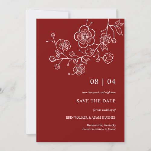
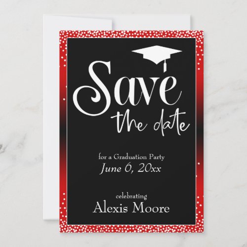
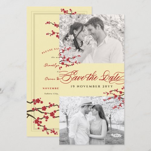
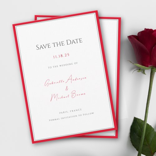
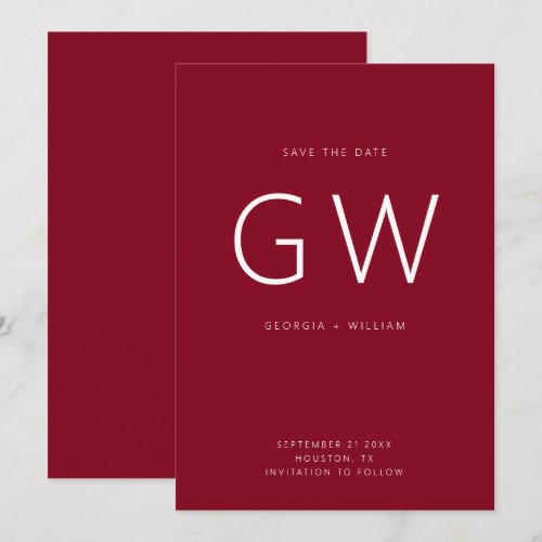
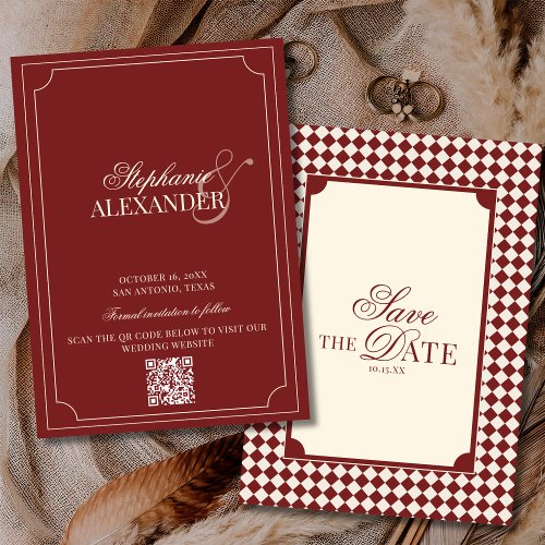
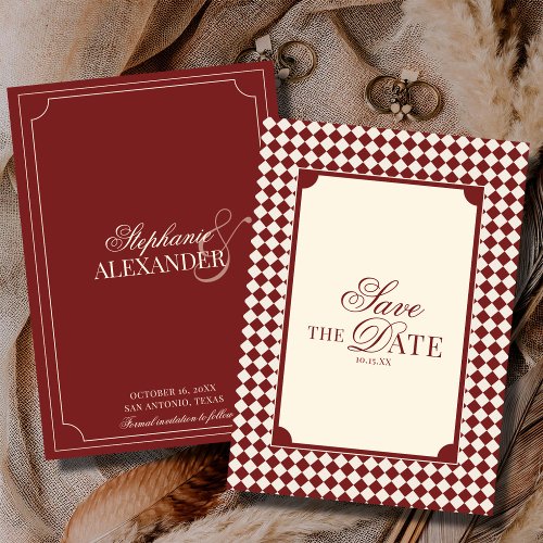
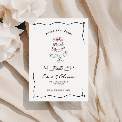
Save the Dates
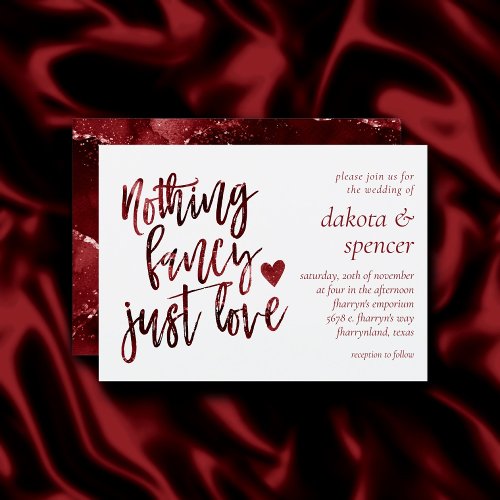
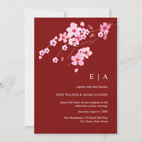
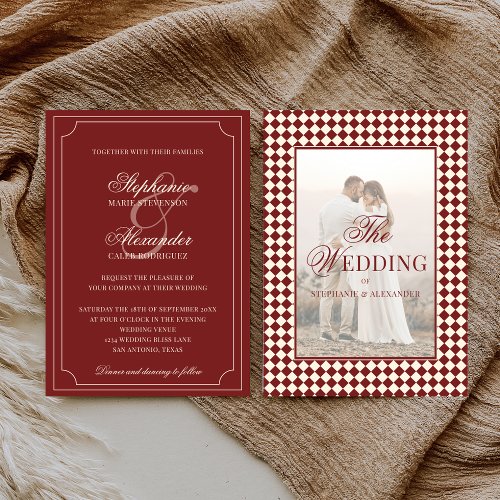
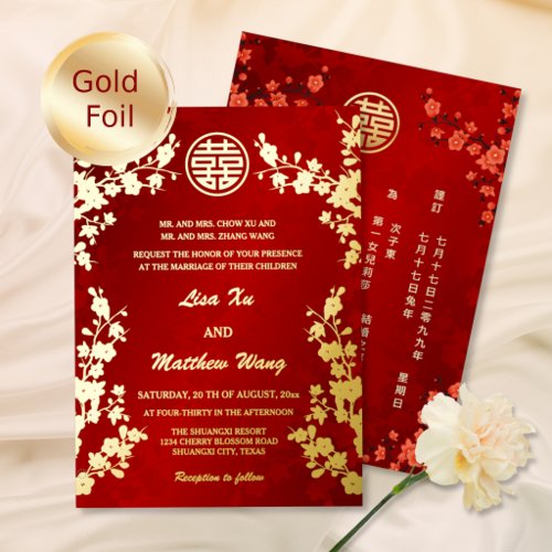
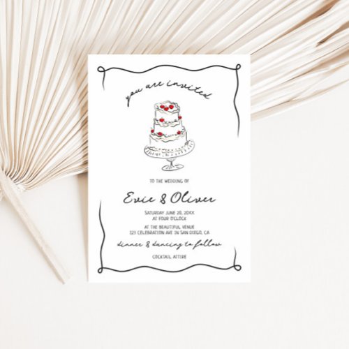
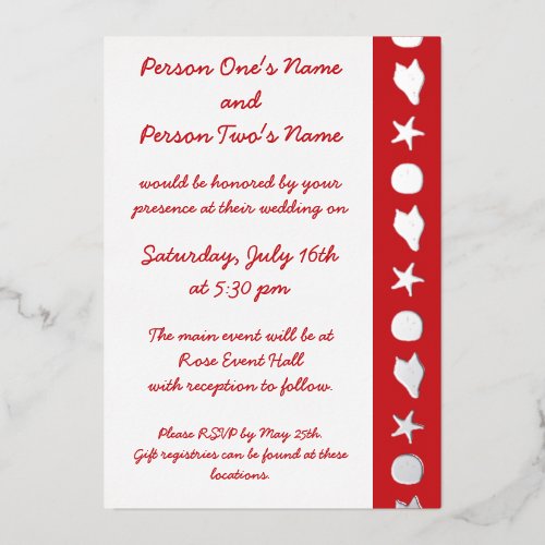
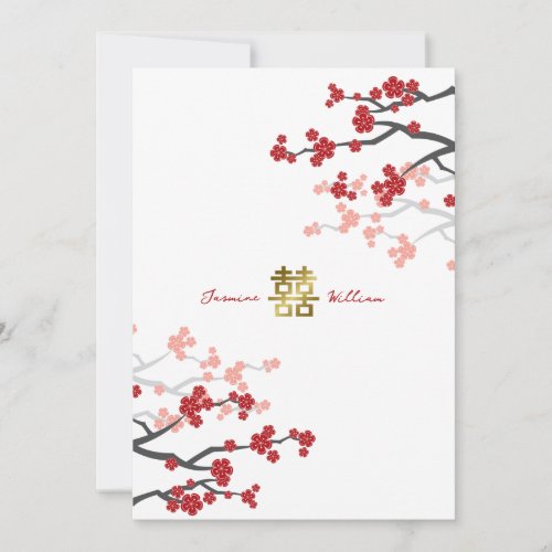
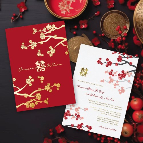
Invitations
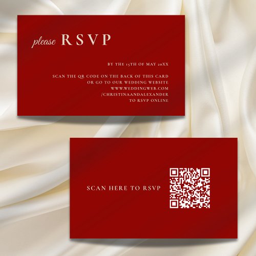
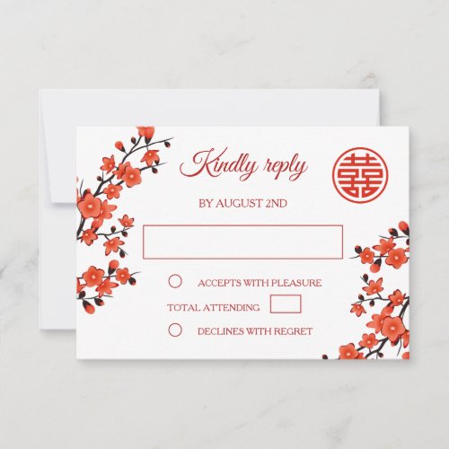
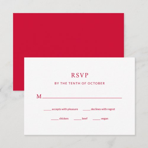
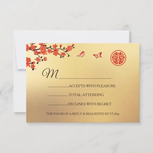
RSVP Cards
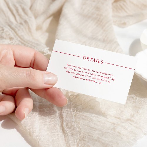
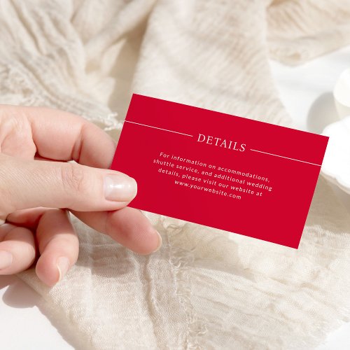
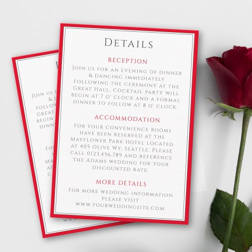
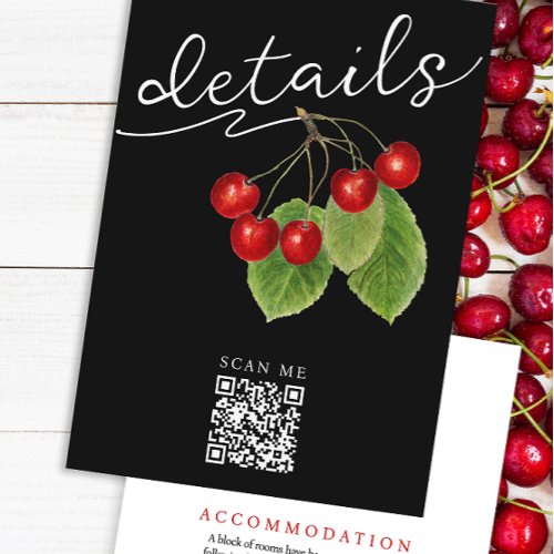
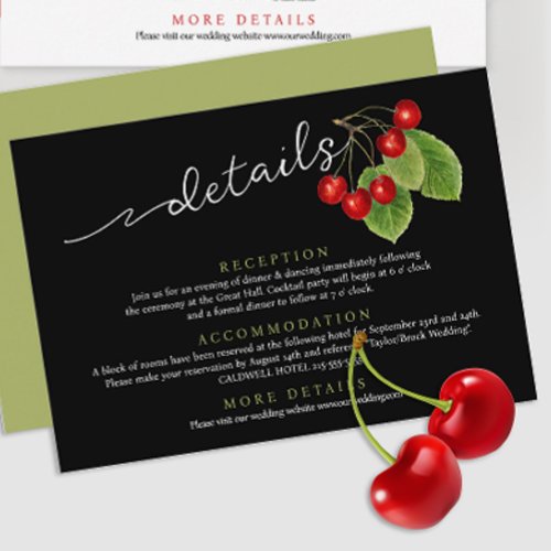
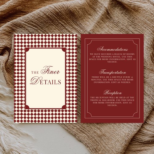
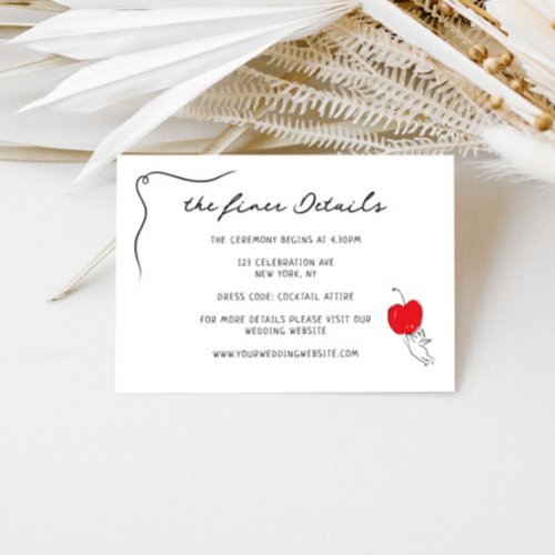
Details Cards

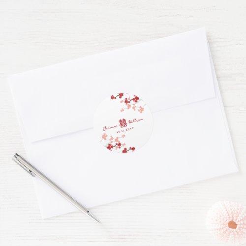
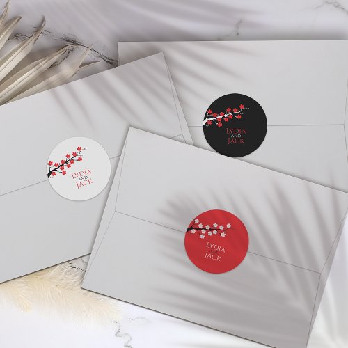
Envelope Seals
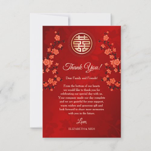
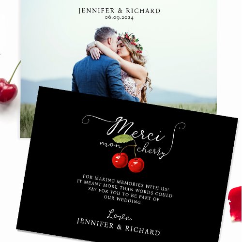
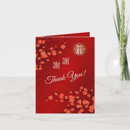
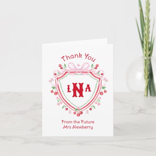
Thank You Cards
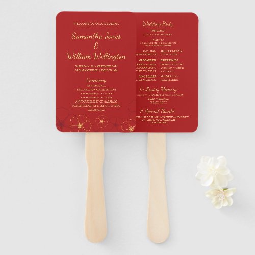
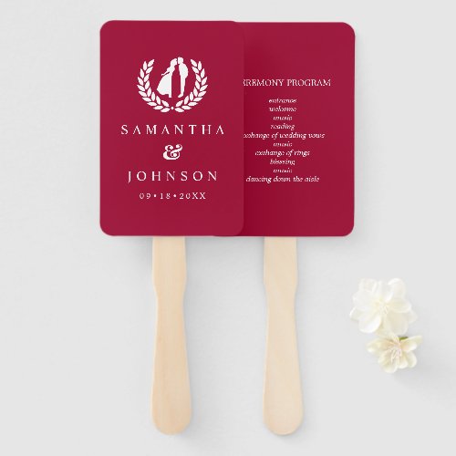
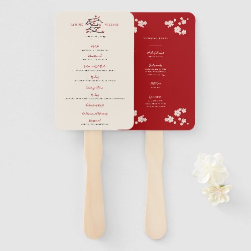
Programs
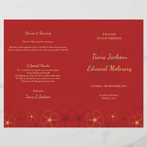
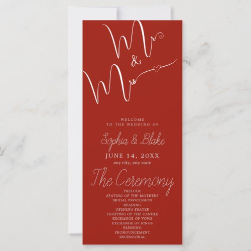
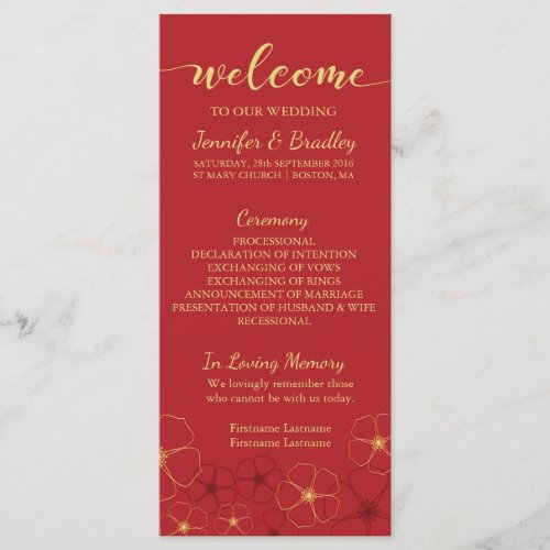
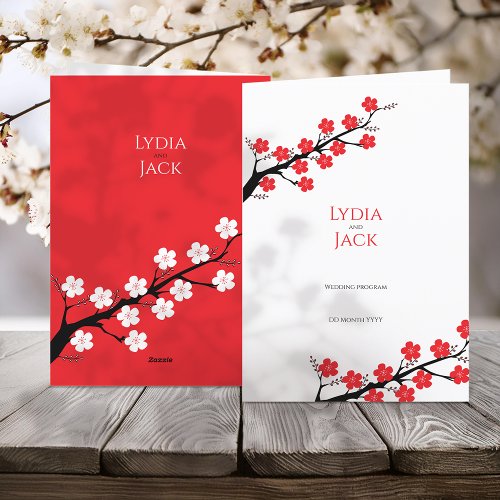
Welcome Signs
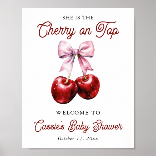
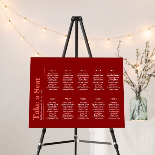
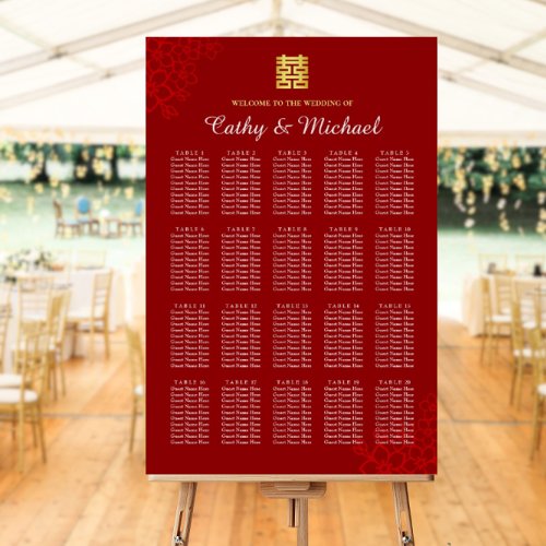
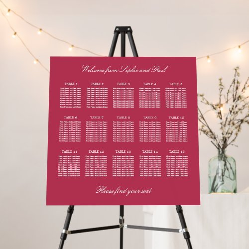
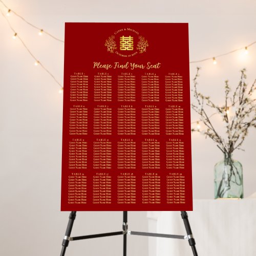
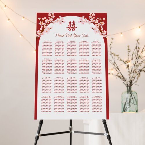
Seating Charts
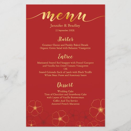
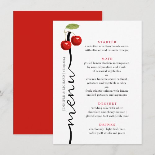
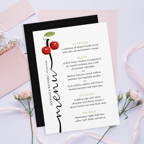
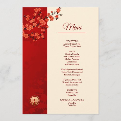
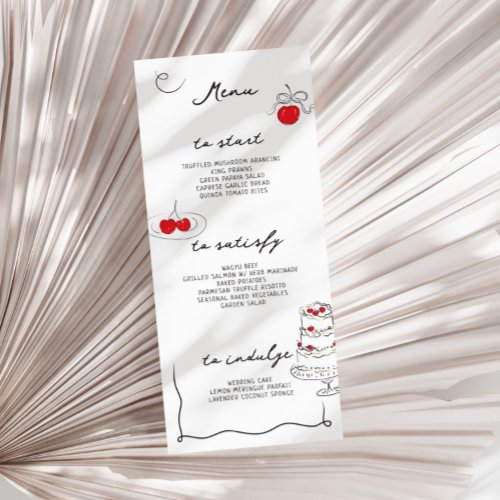
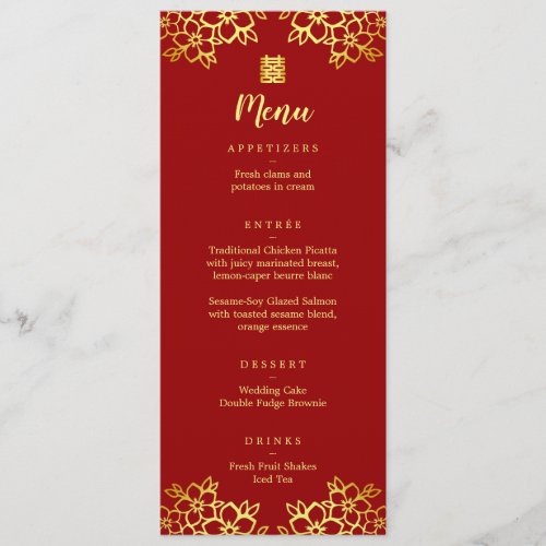
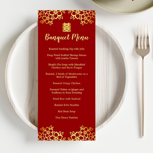
Menus

Place Cards
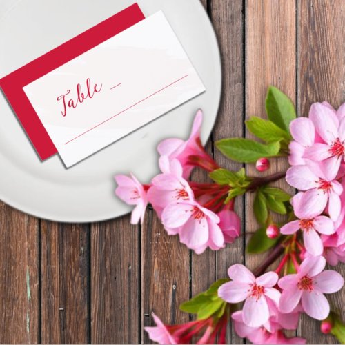
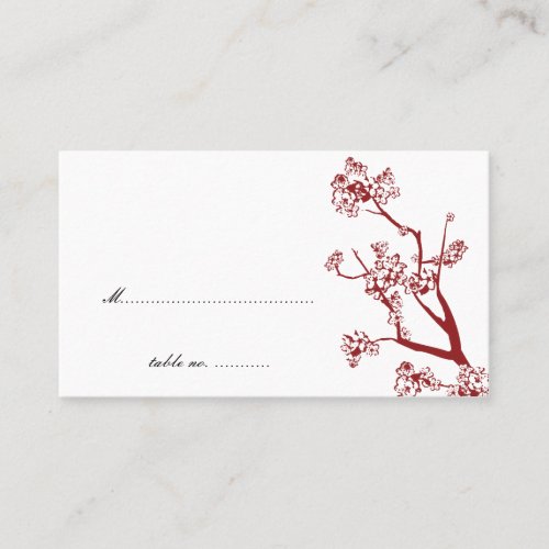
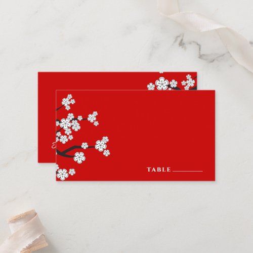
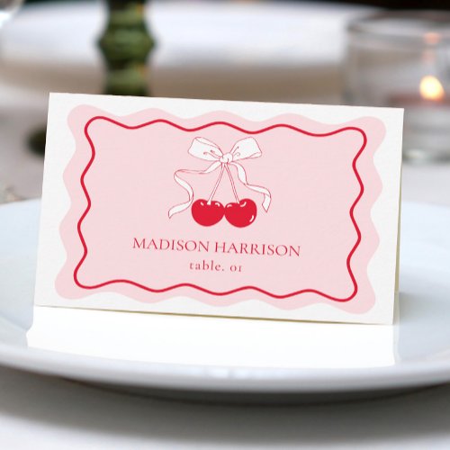
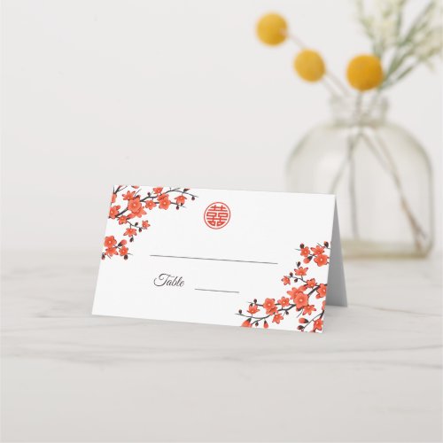
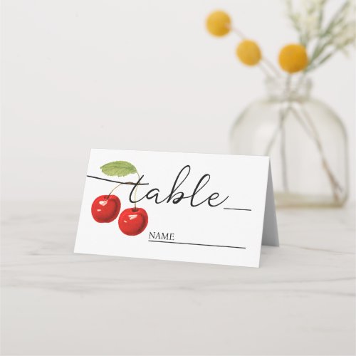
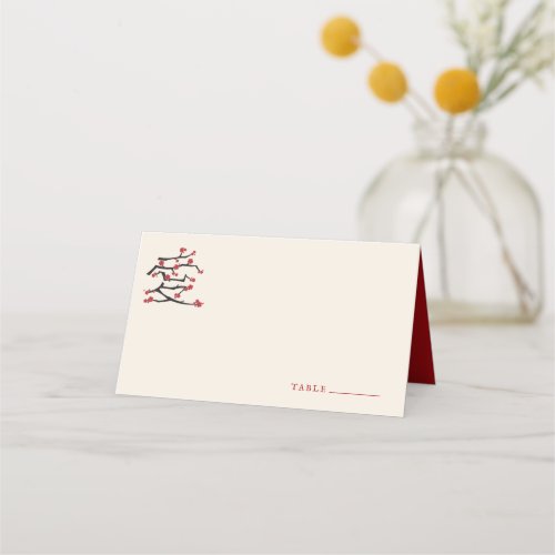
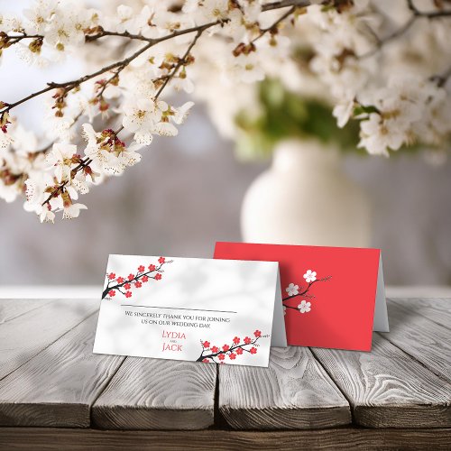
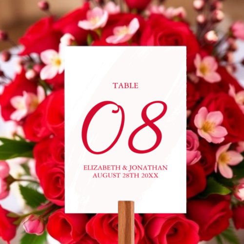
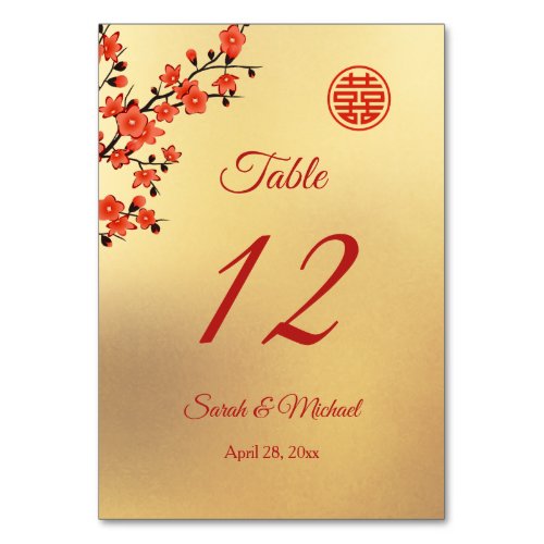
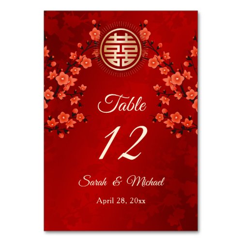
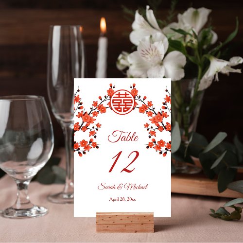
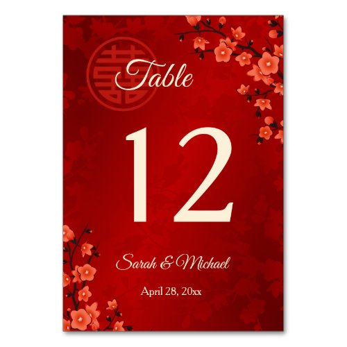
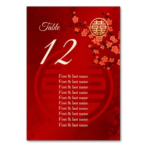
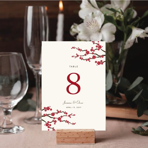
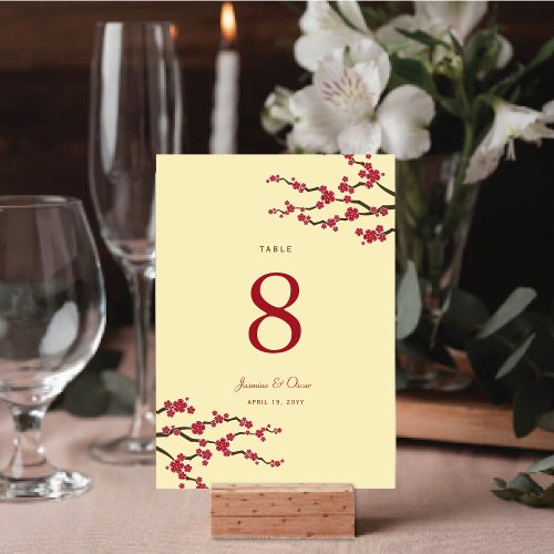
Table Numbers
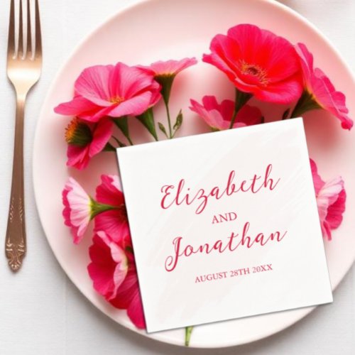
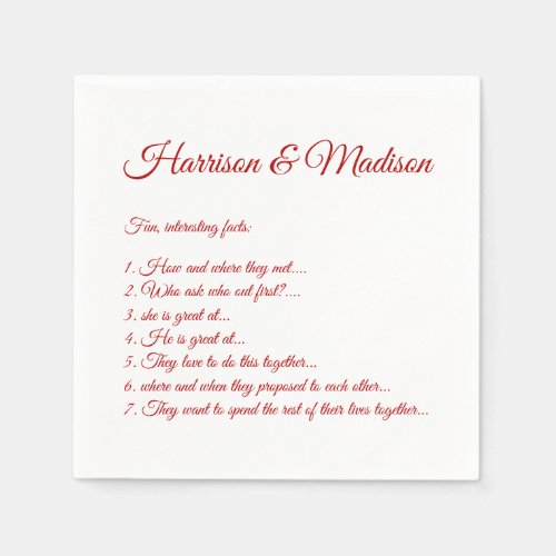
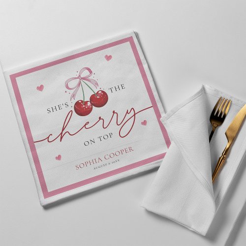
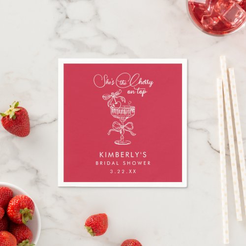
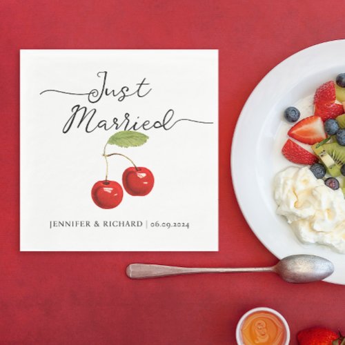
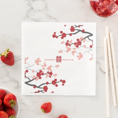
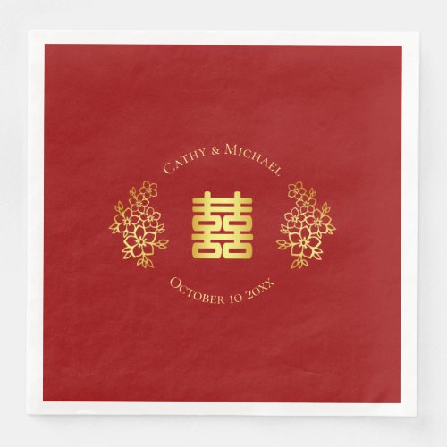
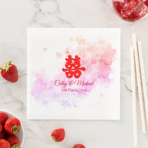
Napkins
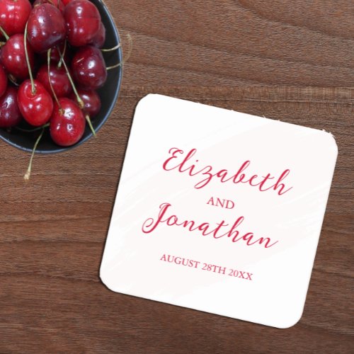
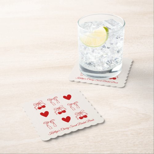
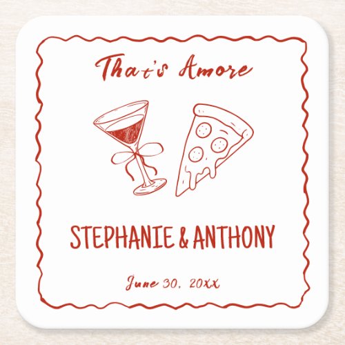
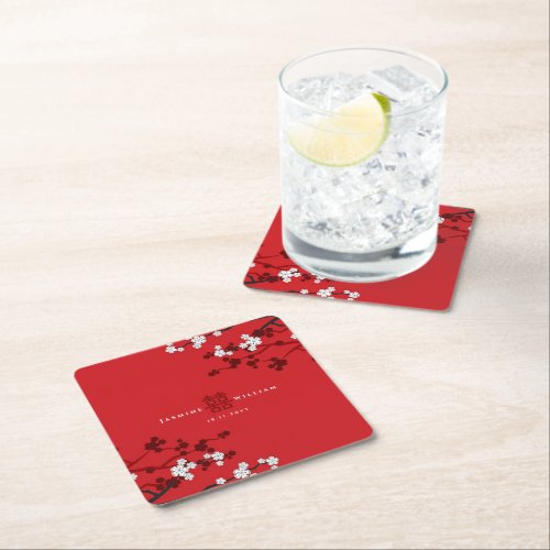
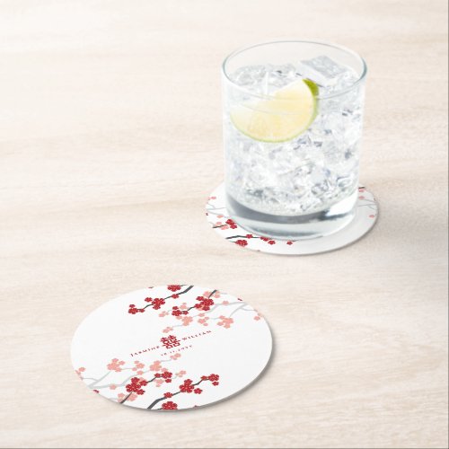
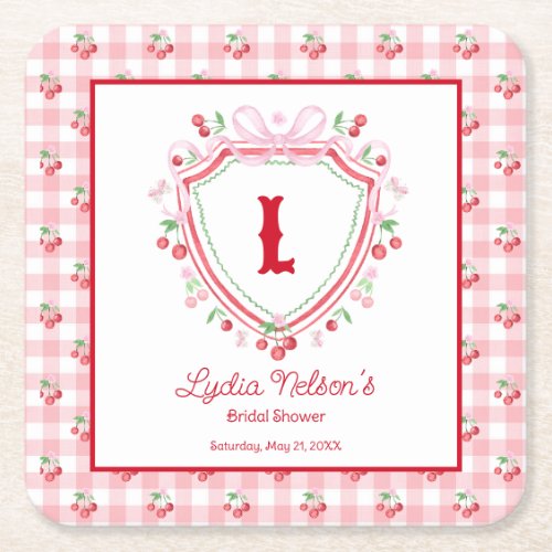
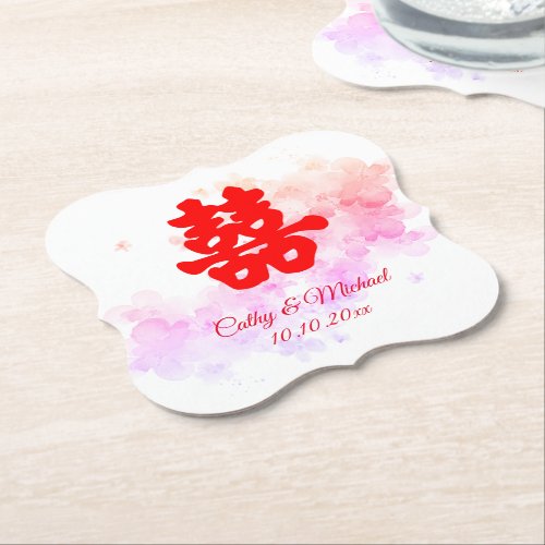
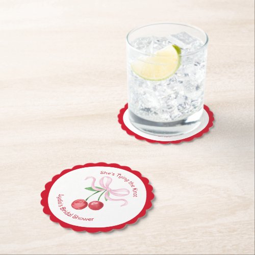
Coasters
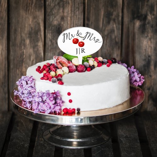
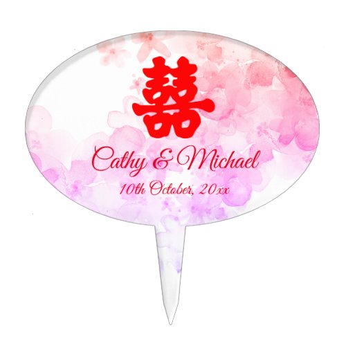
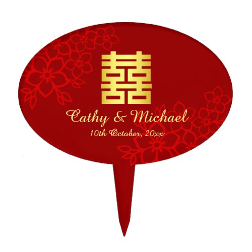
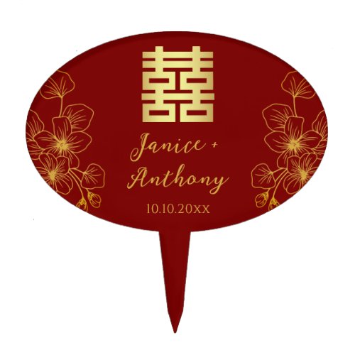
Cake Toppers
Favors
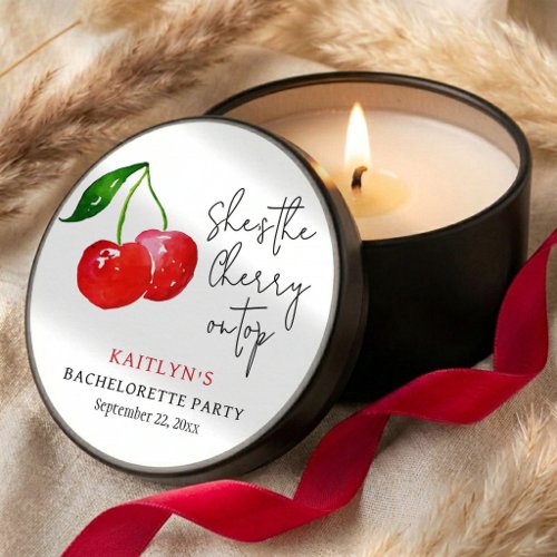
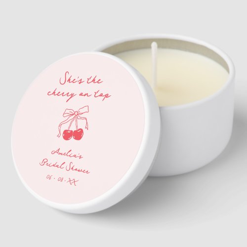
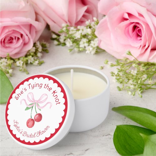
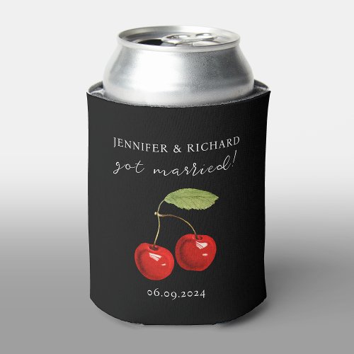
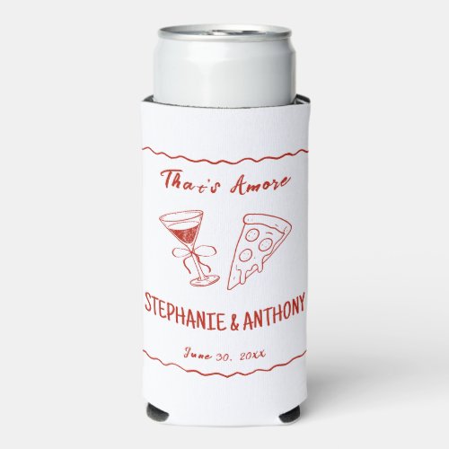
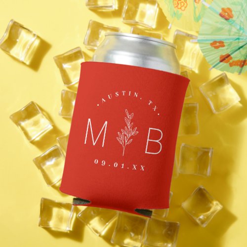
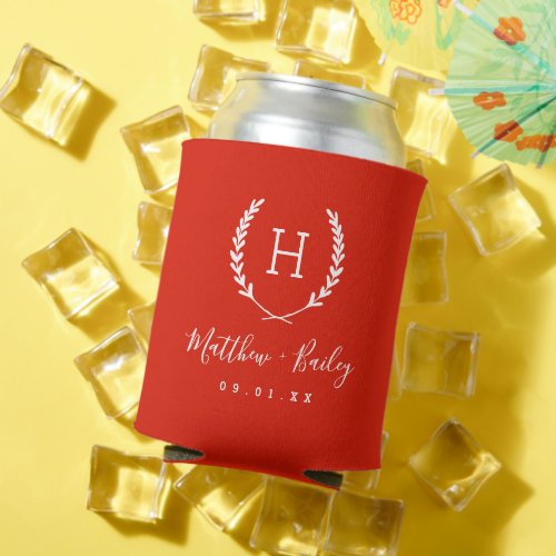
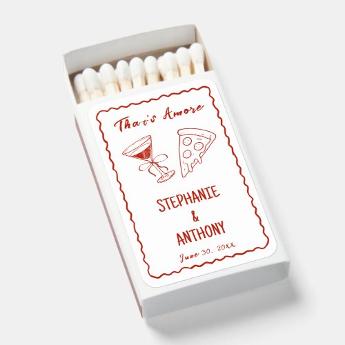
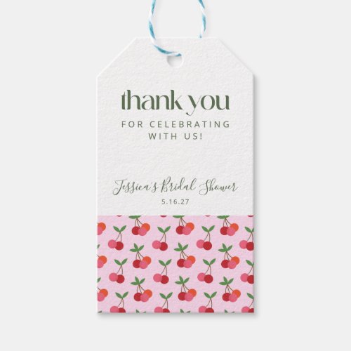
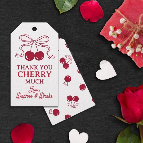
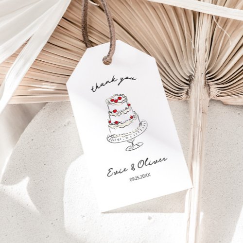
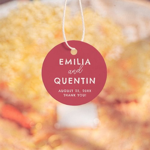
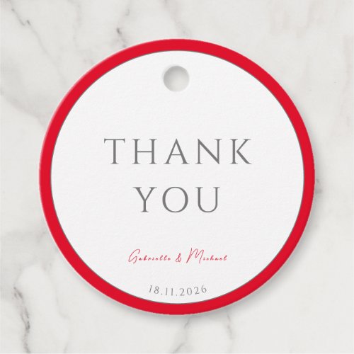
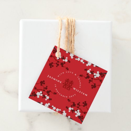
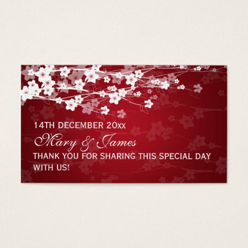
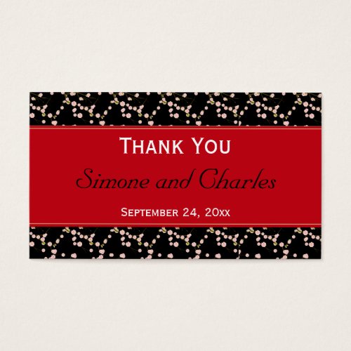
Favor Tags
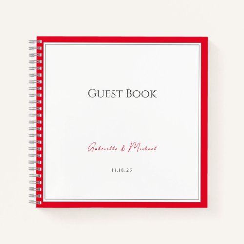
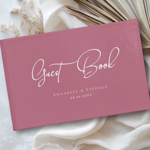
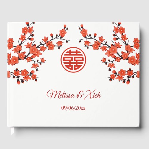
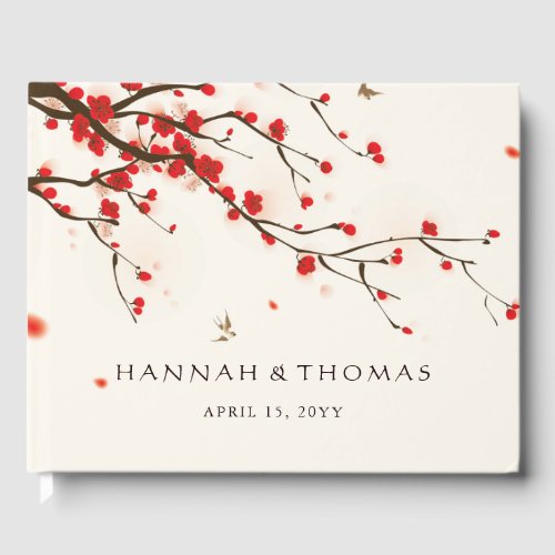
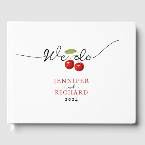
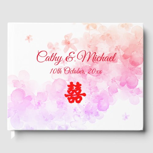
Guest Books

Affiliate links — at no cost to you. Prices shown are from Zazzle as of July 2026 and may change.
Styling tips
- Let red be the only strong colour. Pair it with cream, sand and one metal — the moment a second bright shade joins, the palette gets loud.
- Red ink on cream card stock reads far more elegant than cream ink on solid red for invitations and menus.
- For florals, mix cherry with softer rose and plenty of greenery so the arrangements have depth instead of reading as a block of red.
Frequently asked questions
What colors go with cherry red for a wedding?
Cream, sand and ivory keep it classic and stop it overwhelming the room. Gold suits a formal look; black makes it modern and graphic. Deep green is the best choice if you want a second colour without competing.
Is cherry red different from burgundy for a wedding?
Yes. Burgundy is a deep, wine-toned red that reads muted and autumnal. Cherry red is brighter and cooler — bolder in photographs and more festive, which is why it is trending for winter and city weddings.
Will a red wedding look too much like Christmas?
Only if you pair it with pine green and gold together. Keep the palette to cherry, cream and sand, use rose and greenery in the florals, and it reads romantic rather than festive.